Proposed New Features for Canva Mobile

Project Overview
THE WHAT
This was a project I completed during an immersive UXD program through General Assembly. The goal was to create a new feature and redesign an existing feature for the Canva iOS app.
THE WHO
I worked along with three other designers - Anqi Zhang, Saira Anum, and Taja Ricketts - as a UX researcher and designer through the entire end-to-end process, and was heavily involved in every stage of the process, from user interviews to problem development to design and iteration.
THE WHEN
This project occurred over a two-week sprint during March and April 2022.
THE WHY
On their website, Canva describes itself as “an online design and publishing tool with a mission to empower everyone in the world to design anything and publish anywhere.” Since launching in 2013, Canva has seen rapid growth and the company was valued at $40 billion as of September of last year. However, with more competitors entering the market, Canva especially now needs to focus on features that will set them apart from competitors.
THE HOW
Over a two-week period, we ran an end-to-end process starting with business and user research, and ending with a high-fidelity prototype.

Research and Problem Synthesis
COMPANY RESEARCH: WHAT IS CANVA?
On their website, Canva describes itself as “an online design and publishing tool with a mission to empower everyone in the world to design anything and publish anywhere.” They provide users with a wide variety of design tools, including many ready-to-use templates for various types of content (social media posts, flyers, logos, presentations, etc). Through their platform, Canva wants to provide all people with the ability to design and create content, regardless of their level of expertise or experience. Canva’s target audience represents a wide variety of users - whether it be small business owners, social media influencers, students, event planners, or even experienced designers, Canva’s goal remains the same: to provide an easy-to-use and intuitive design platform that meets the needs of all users across all industries and experience levels. Since launching in 2013, Canva has seen rapid growth and the company was valued at $40 billion as of September of last year. However, with more competitors entering the market and powerhouse design company Adobe recently launching their similar Creative Cloud tool in December, Canva needs to focus on features that will set them apart from competitors.
One phrase within the mission statement stands out in particular: “...publish anywhere.” In addition to providing a wide range of tools for a variety of use cases and users, Canva also wants to provide the flexibility to create anywhere, not just from a desk or at a computer. It is with this context that the importance of Canva’s mobile application becomes clear. By providing a mobile version in addition to the desktop application, users really can publish anywhere: whether on the bus to work, before bed, in line at the grocery store, or elsewhere, the Canva mobile app provides this flexibility that wouldn’t be possible with just a desktop version.
However, through our research, it has become apparent that the Canva mobile application isn’t nearly as intuitive or user-friendly as its desktop counterpart. There were complaints from mobile users about inconsistencies between the desktop and mobile versions, lack of support/onboarding, and frequently-used actions being buried in menus. While the mobile version does a lot of things right and provides a variety of helpful tools, it doesn’t stack up to Canva’s key value of “making complex things simple.” With this in mind, we are looking to redesign elements of the mobile application to provide a more pleasant content creation experience, one that matches that of the desktop version and better reflects Canva’s mission statement.
BUSINESS RESEARCH: THE CURRENT MARKET
I first wanted to focus on other businesses in the visual content creation space, to get an idea of the current state of the market. Below is a feature inventory that compares Canva to other similar products. Notice that none of the platforms currently offer personalization options for their editing tools.
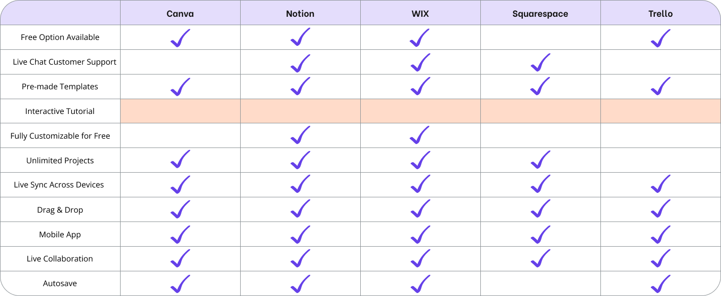
I also wanted to get a better sense of the features of content creation platforms outside of the visual design space. I conducted the following competitive analysis of different website creation and project planning platforms. As you can see, none of these companies currently offer interactive tutorials for new users
USER RESEARCH
Between our design team, we conducted a total of eight user interviews. We asked participants about their experience with both the desktop and mobile versions of Canva, and dug into what they found enjoyable as well as frustrating about them. We also inquired about what they primarily use the Canva platform for, and whether they prefer using the mobile or desktop version.
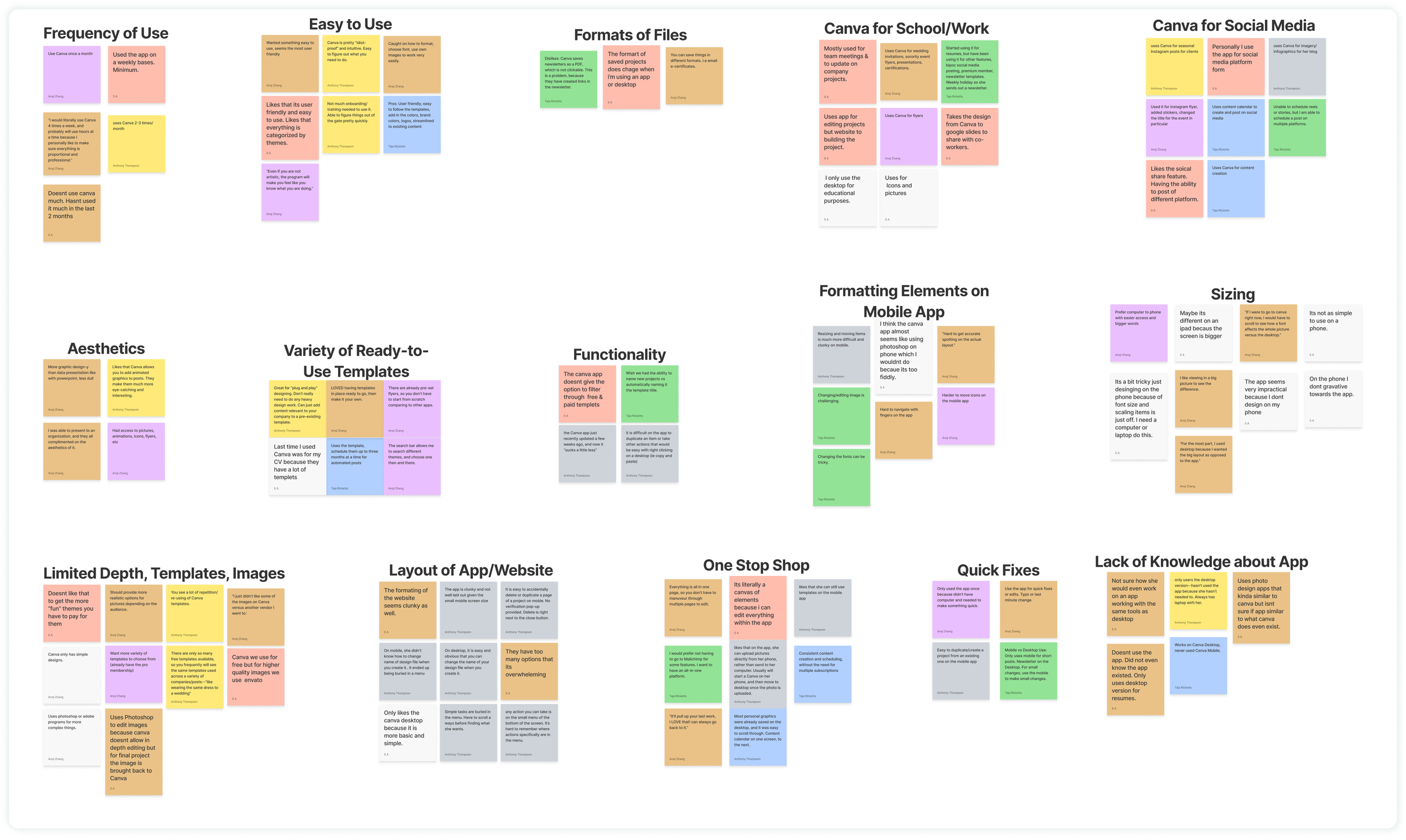
Below you’ll find the affinity map we created based on our research. This allowed us to find themes and commonalities among the interview feedback we received. The different color post-it notes represent the 8 different interviewees.
We then developed 15 “I statements” based on the insights and grouping we observed above. We decided to focus on the following three going forward with our design:
I want consistency, familiarity, and adaptability across the mobile and desktop experience
I prefer a simplified mobile layout that’s intuitive and easy to use
I like that the mobile app offers the flexibility to edit projects from any location
DEVELOPING A PERSONA
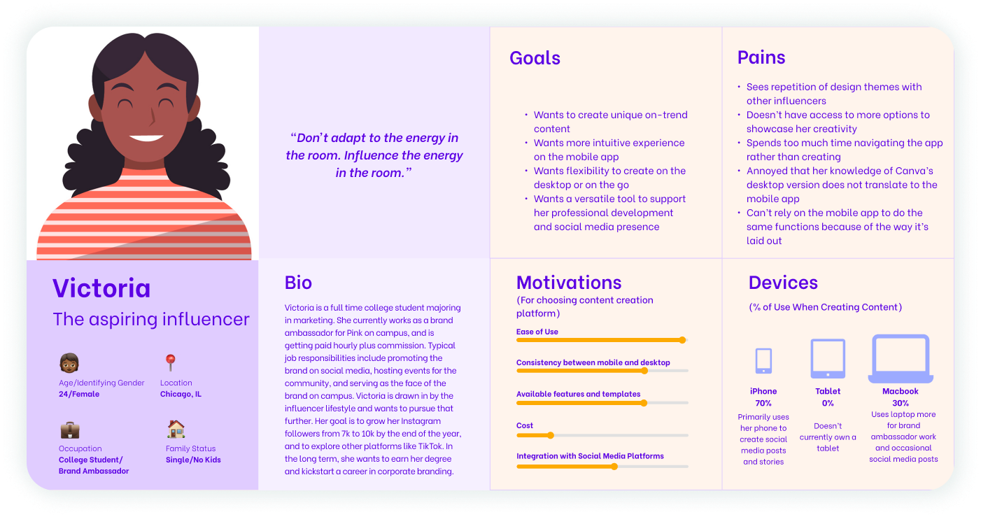
Based on the findings from our user interviews, I developed the following persona, Victoria, to represent Canva’s target user.
To summarize, Canva’s target user is someone who is active on social media in a variety of different contexts. They use Canva to create content for their personal social media pages, and may also use it to create marketing for a small business or sales-related job. While not necessarily an expert in design principles or software, Canva’s target user is generally tech savvy and is up to date with current technology and internet trends.
MAPPING THE USER’S JOURNEY
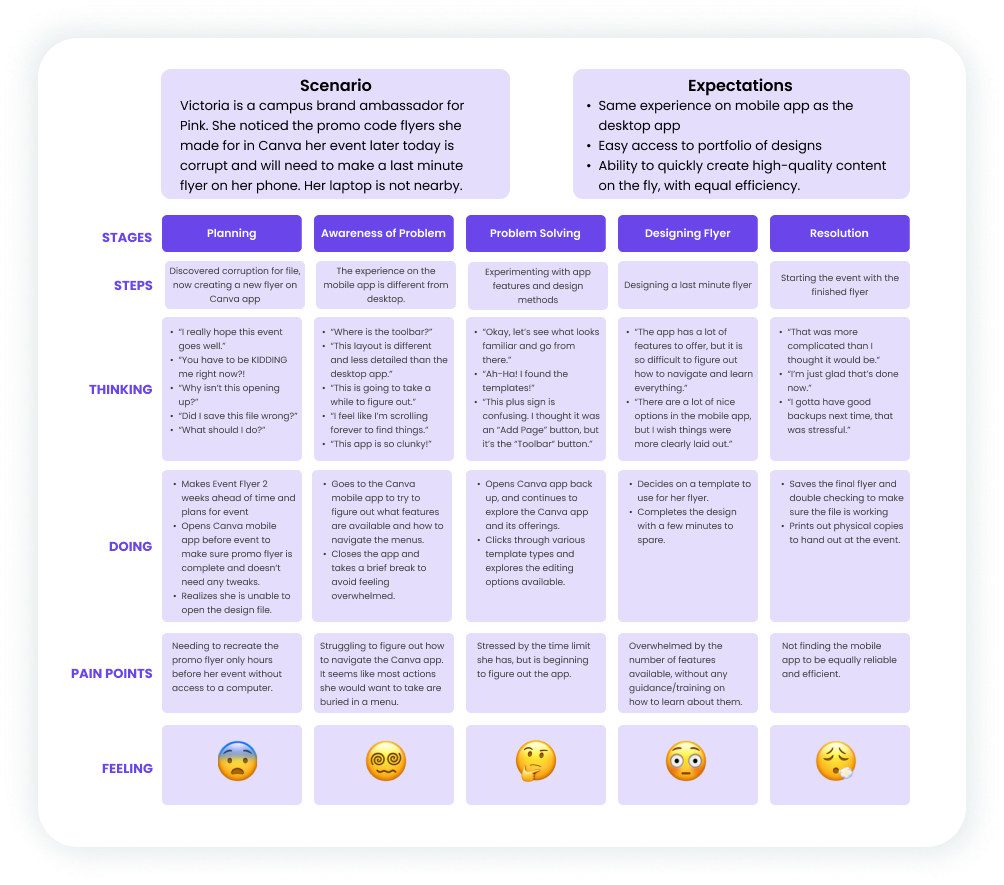
After developing our persona, we created a journey map for them to get a better sense of their experience through each step of using the Canva mobile app.
THE PROBLEM WE WANT TO SOLVE
With the problem statement defined, we moved onto the design and delivery phases. Going forward, we decided to focus on the first three ‘How Might We’ statements above by redesigning Canva’s toolbar to allow for improved usability and personalization, and adding a new interactive tutorial feature to help improve users’ knowledge of Canva app functionality.

Website Structure and Design
USER FLOWS
After determining the features we wanted to focus on, we set out on creating user flows to get a better idea of how the functionality would fit within the existing Canva mobile framework. The first user flow below highlights the new interactive tutorial feature. The steps circled represent what is new to the mobile platform.
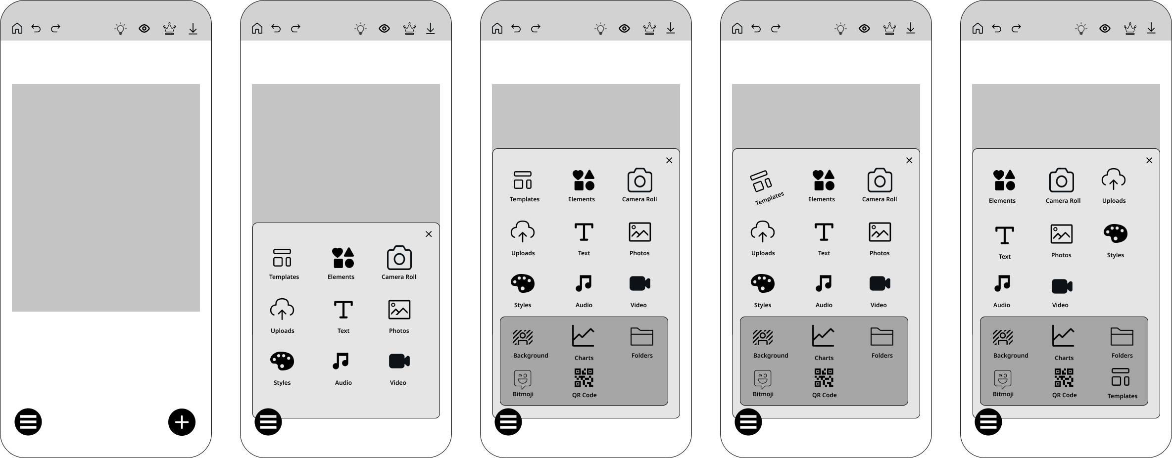
The next user flow represents the re-designed toolbar that allows users to customize how they want to order items as well as remove items if they aren’t used.
CANVA’S CURRENT MOBILE PLATFORM
Below you can see Canva’s main home page on the left, as well as the project edit screen in the middle. The rightmost frame shows Canva’s current toolbar, which allows users to upload elements from a variety of sources to their projects. As you can see, there is a lot of information to sort through, and users have to scroll quite a bit to see options.
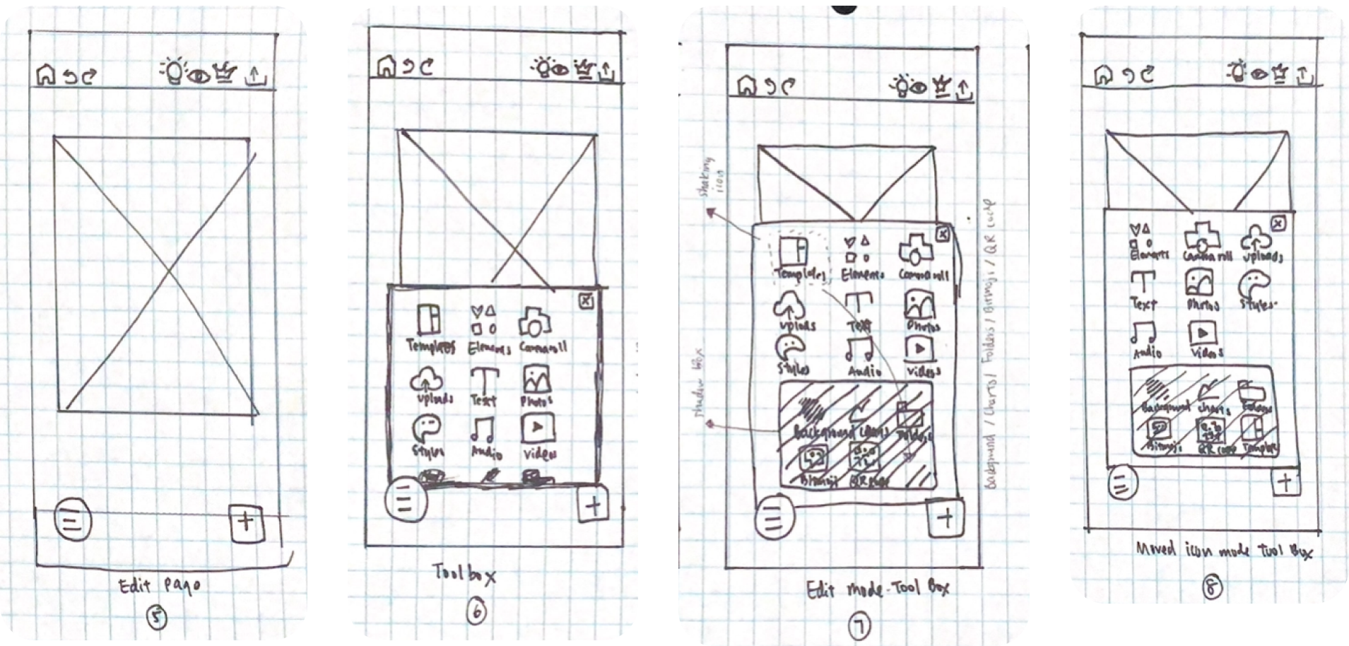
SKETCHING AND WIREFRAMING
From there, we began sketching out workflows and developing mid-fidelity wireframes.
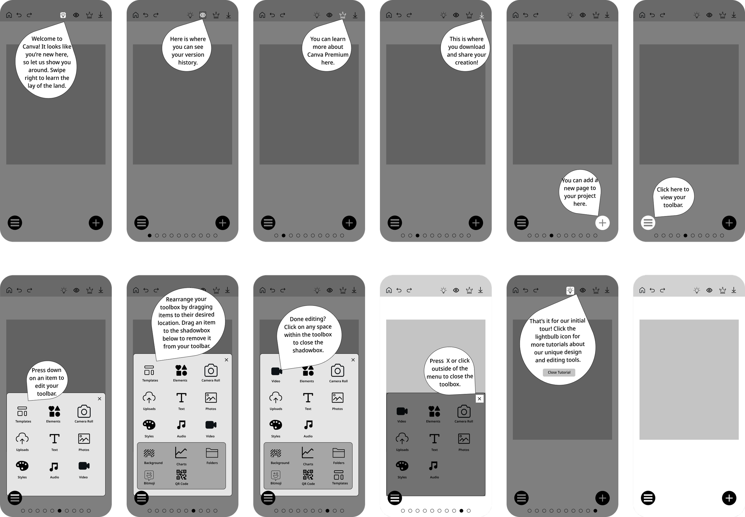
Interactive Tutorial
Personalized Toolbar
GATHERING FEEDBACK: USABILITY TESTING
What we Tested
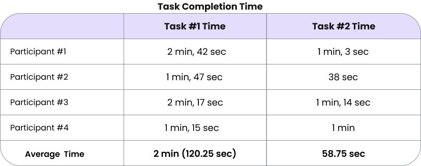
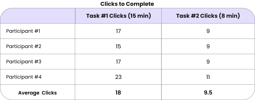
Using the prototype above, usability tests with 4 participants were conducted to gather feedback on the new features. Users were asked to complete the following two tasks, with the goal of completing task #1 in less than 2 minutes and 15 clicks and task #2 in less than 1 minute and 8 clicks.
Quantitative Results
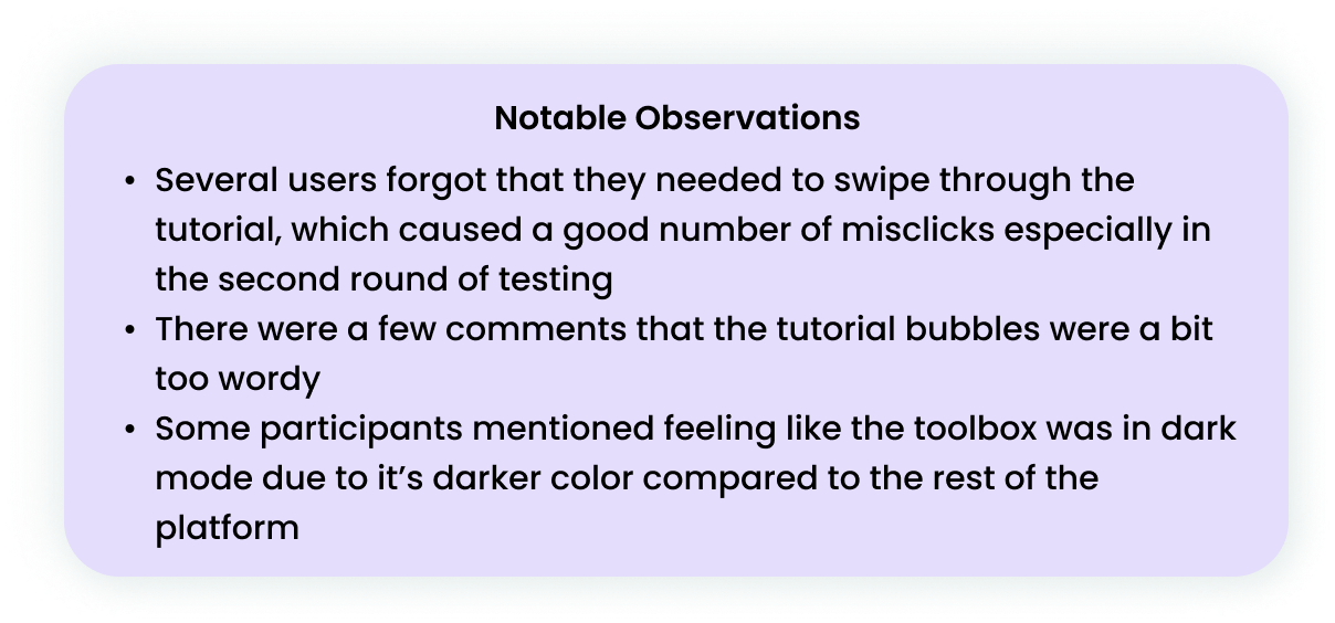
Qualitative Results
DESIGN SYSTEM
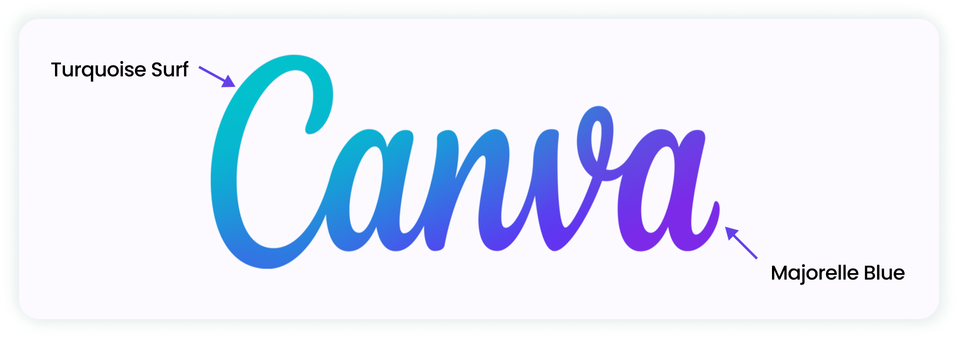
On the left, you can see Canva’s “signature” gradient, which is featured frequently in Canva – both in their logo and on most screens, usually in their menu at the top of the page.
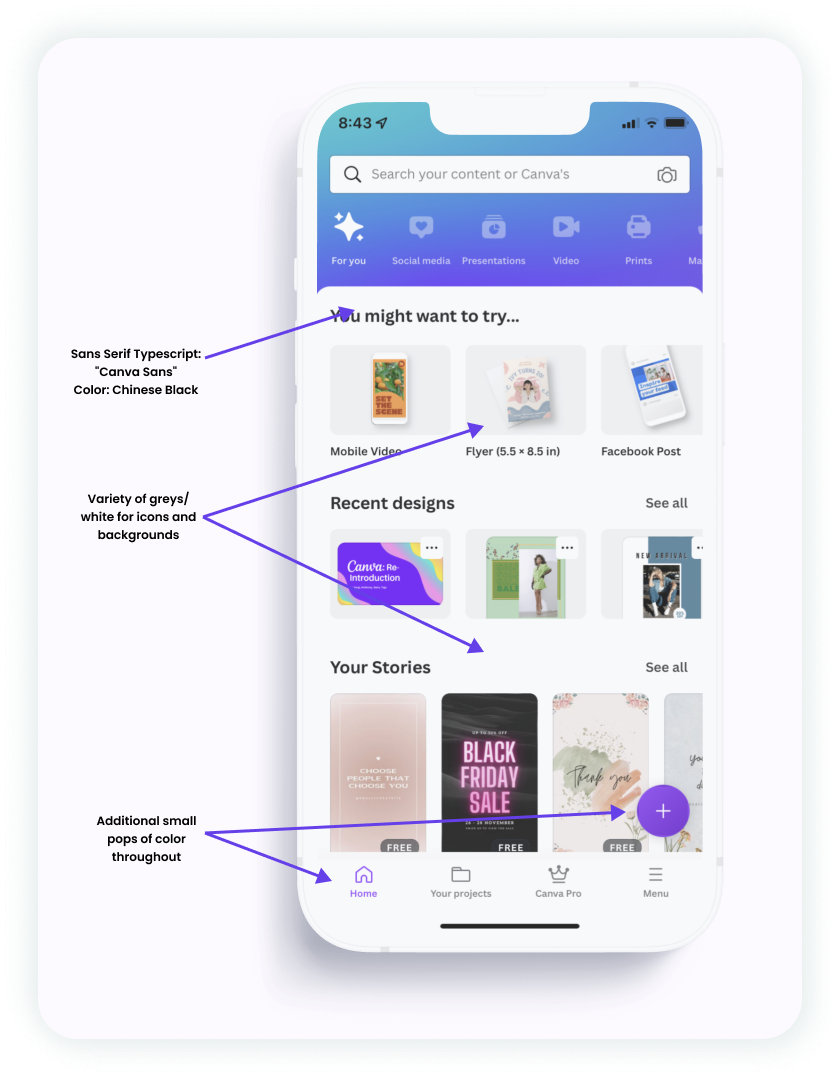
Other than the gradient, Canva doesn’t use too much color through the rest of their app. They use whites and greys for icons and backgrounds, and a black sans-serif font for text. There are some additional pops of color, for example with the selected item in the submenu and circular “add” button, but for the most part there isn’t much color outside of their use of the gradient.
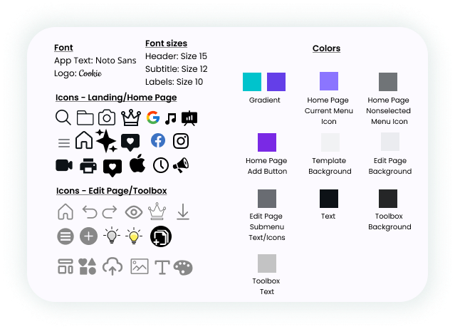
To the left, you can see a collective list of the typescripts, icons, and colors used throughout the Canva mobile app.
HIGH-FIDELITY WIREFRAMES
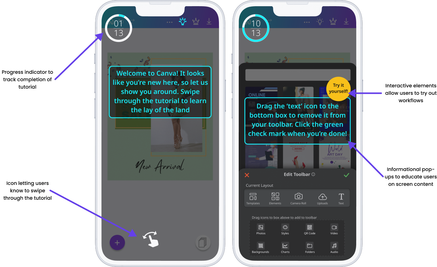
Based on the usability testing results and design system research, we developed the following high-fidelity wireframes for the two features:
Interactive Tutorial
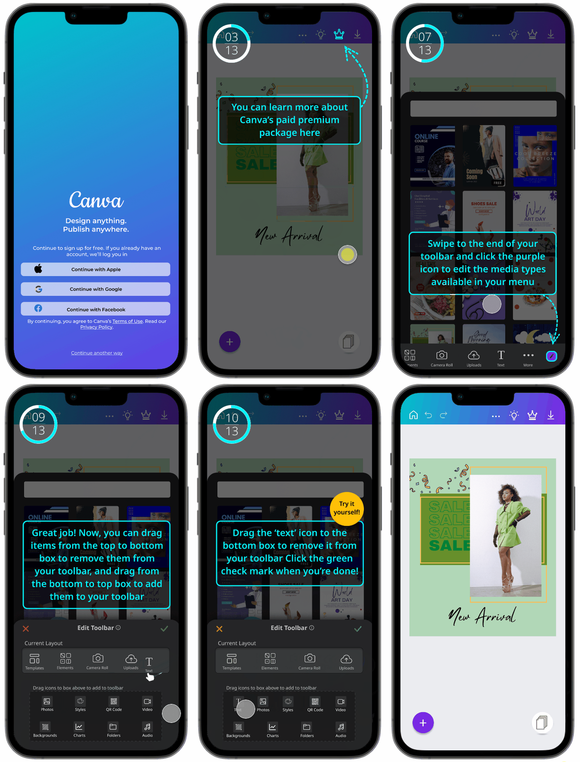
You can view the tutorial in action below:
Personalized Toolbar
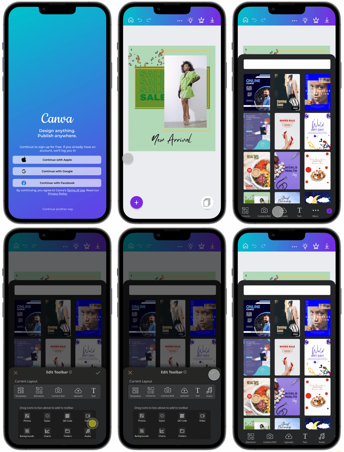
You can view the personalization feature in action below:
NEXT STEPS
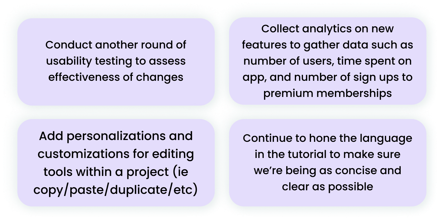
While our project ended here, we identified the following next steps that would be beneficial to address when picking up the project again:
CHECK IT OUT FOR YOURSELF!
You can try the interactive prototype of the tutorial and personalized toolbar below.
Interactive Tutorial
Personalized Toolbar
FINAL THOUGHTS AND LESSONS LEARNED
As the first full group project in the cohort, I had a wonderful experience working with my team. We communicated effectively, equally shared work, and managed our time very well throughout the two-week sprint. I also learned a lot about working specifically within a team of designers, including effectively brainstorming ideas, compromising and finding middle ground, and managing workload/areas of ownership.
Through this project, I also realized the importance of consistency in typography and iconography types within a platform. Initially when completing mid-fidelity wireframes, we used a wide variety of icons - some were solid style while others were outline, and the lines were of varying weights. This led to a sloppy, unpolished product that felt disjointed and hastily put together. We ended up adding more consistent iconography, and it made an immense difference. Going forward, I will make sure that iconography styles and typography remain consistent throughout products I’m designing.
Thanks so much taking time to review this project! If you’d like to see more, you can check out some of my other work here:


