Remote Interview Support Feature in Zoom

Project Overview
THE WHAT
This was a two-part project I completed regarding the remote job seeking and interviewing experience. I was tasked with creating a new feature for a mobile app that would help improve remote job-related experiences. Based on user research and synthesis, I chose to focus on the remote interview process with a new preparation feature for Zoom’s mobile platform.
THE WHO
For the research portion of the project, I worked with three fellow designers - Theo Harding, Diana Tokareva, and Nabely Zacarias. We all conducted individual user interviews and shared data amongst the team. From there, we then split off and worked individually to synthesize our findings and design unique solutions to help with the remote job-seeking process.
THE WHEN
This project occurred over a two-week sprint during February and March 2022.
THE WHY
The onset of the coronavirus in 2020 required many forms of professional communication to transition to a virtual space, and job seeking and interviewing were no exceptions to that trend. At the initial height of the pandemic in April 2020, 86% of companies moved to a remote setting for their job interviews, with many maintaining virtual interviews for the following months as COVID persisted (source: Tech Republic). While a sense of normalcy has somewhat returned in the recent months, remote job interviews are unlikely to go away anytime soon. According to a November 2021 SHRM poll of over 1000 employers, 76% of companies plan to continue conducting interviews remotely for the foreseeable future (source: SHRM). Given the abruptness of this virtual shift, I wanted to do some research on the impact this change has had on job candidates—what has changed for the better, what are some pain points, and how well have job-seeking/interviewing mobile applications been in supporting this virtual communication framework? It is with this larger context that I began my research and subsequent design work.
THE HOW
Over a two-week period, I ran an end-to-end process starting with user research, and ending with a mid-fidelity prototype.

Research and Problem Synthesis
THE USER EXPERIENCE: CONDUCTING INTERVIEWS
In a team of four researchers, we conducted a total of five user interviews. We asked participants about their experience with both the remote job-seeking and interviewing experience, and dug into what they found enjoyable as well as frustrating about it. We also inquired about what mobile apps they’ve used for remote job-searching/interviewing and what they liked or disliked about them.
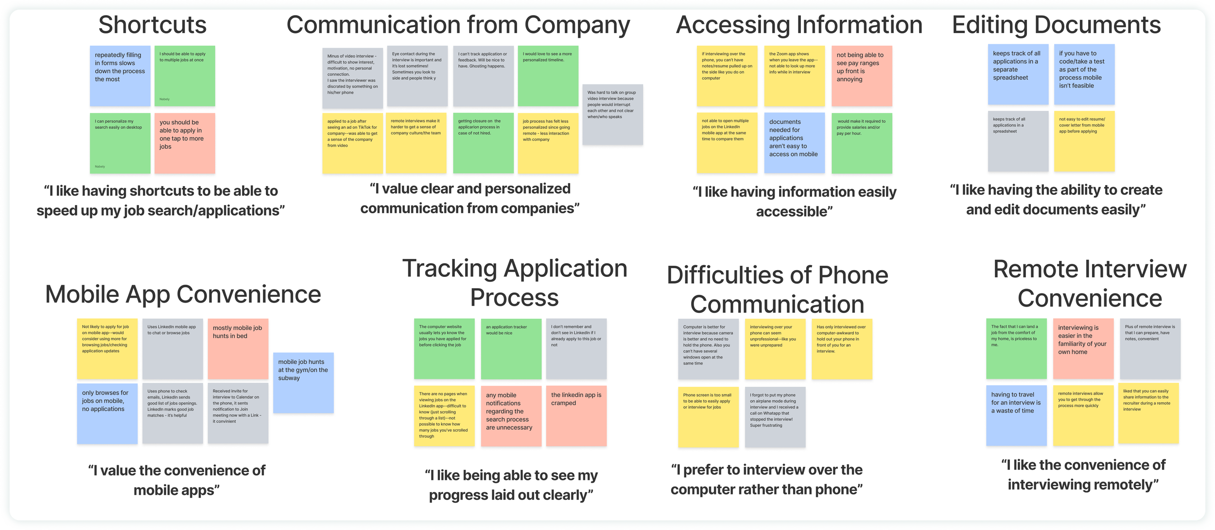
Below you’ll find the affinity map we created based on our research. This allowed us to find themes and commonalities among the interview feedback we received. The different color post-it notes represent the 5 different interviewees.
I chose to hone in on three specific insights that I gleaned from the interview data, which focus primarily on the remote job interview experience:
Effective and frequent communication from companies is highly valued, but virtual interviews make communication a bit more challenging
It is important to have information easily accessible during a job interview or job search
Remote interviews offer more convenience and flexibility than in-person interviews, but they also make it more difficult to get a sense of company culture
OUR TARGET USER: DEVELOPING A PERSONA
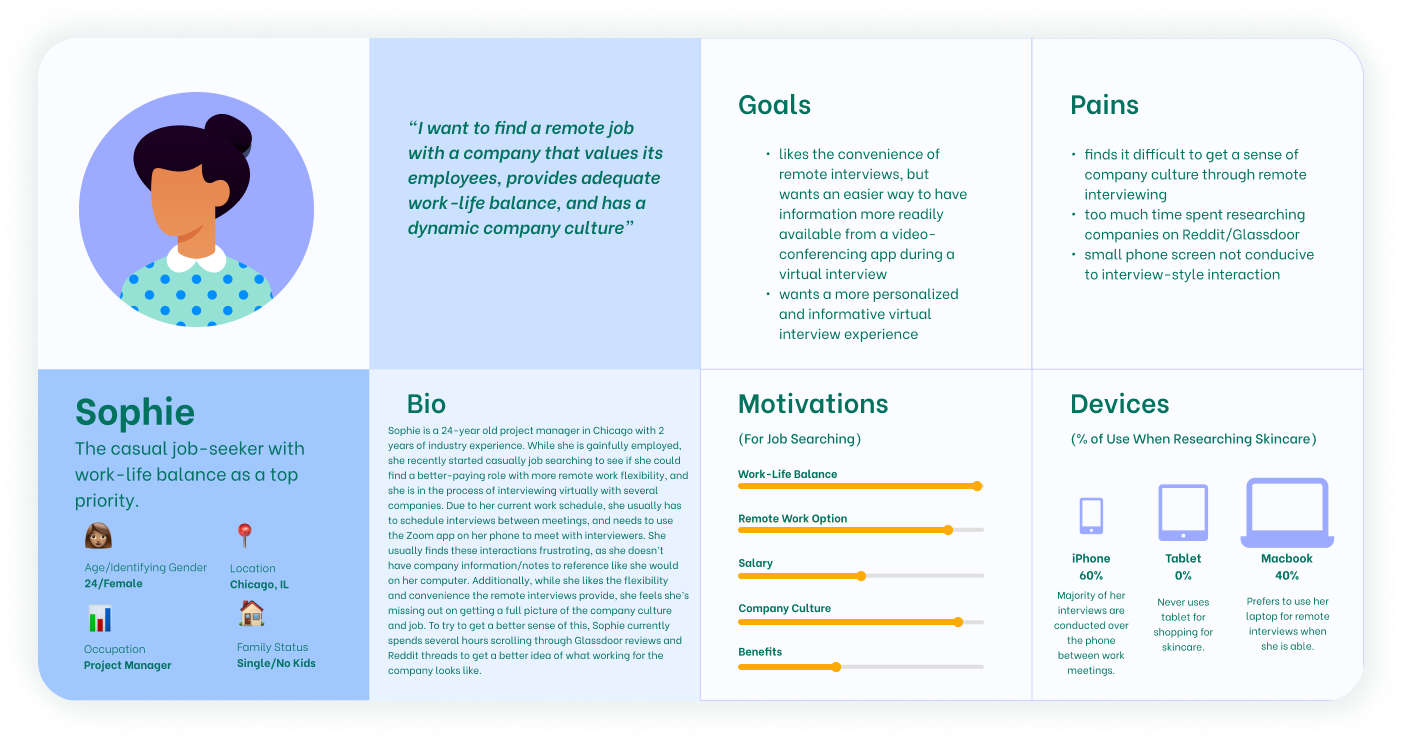
Based on the findings from our user interviews, I developed the below persona to represent the target user.
To summarize, the user I developed on is a passive job-seeker, looking casually for job opportunities that may provide a better salary, work-life balance, or a remote option. They are gainfully employed and enjoy their job for the most part, but still thinks there could be something better out there. Work keeps them busy, so most remote interviews take place over the phone in between meetings. Company culture is very important to them, and they want to make sure they’re able to get a sense of this during the interview.
THE PROBLEM WE WANT TO SOLVE
After synthesizing research and identifying the target user, I formulated the following problem statement to help narrow in on potential solutions:
Based on the problem above, I decided focusing my design on a video conferencing platform would provide the most benefit in relation to the pain points mentioned during user interviews. Because of this, I decided to focus on brainstorming solutions for the Zoom mobile app, a common video conferencing tool for remote interviews.

Website Structure and Design
USER FLOWS
With the mobile platform decided on, it was time to think through some potential features that would be useful for candidates during virtual interviews. Based on the above research, I chose to design the following features for the Zoom mobile app:
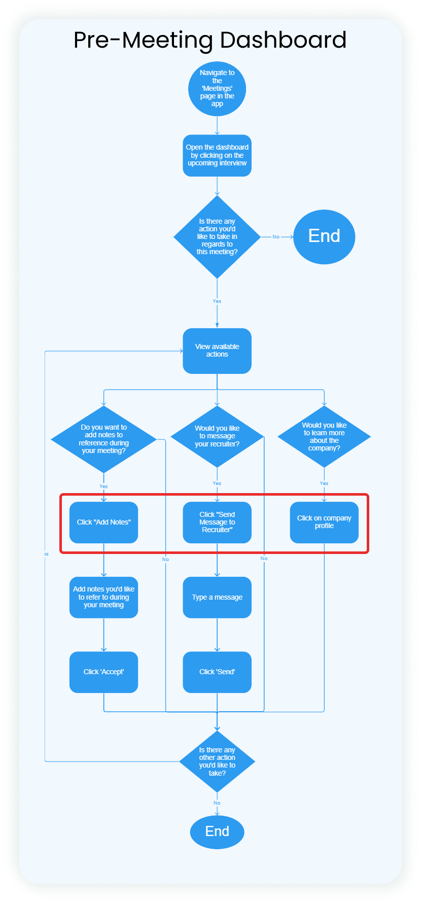
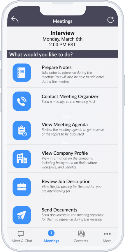
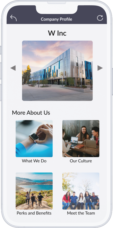
1. An interview/meeting preparation screen, represented in the left user flow below, where candidates can take notes for reference during their interview, contact their recruiter, and view the job description. Users can also view a company profile page, where they can learn more about the company and its values. This new feature would also allow users to select a meeting type (ie interview, presentation, brainstorm session, etc) when scheduling, so different preparation options would be available depending on what was selected.
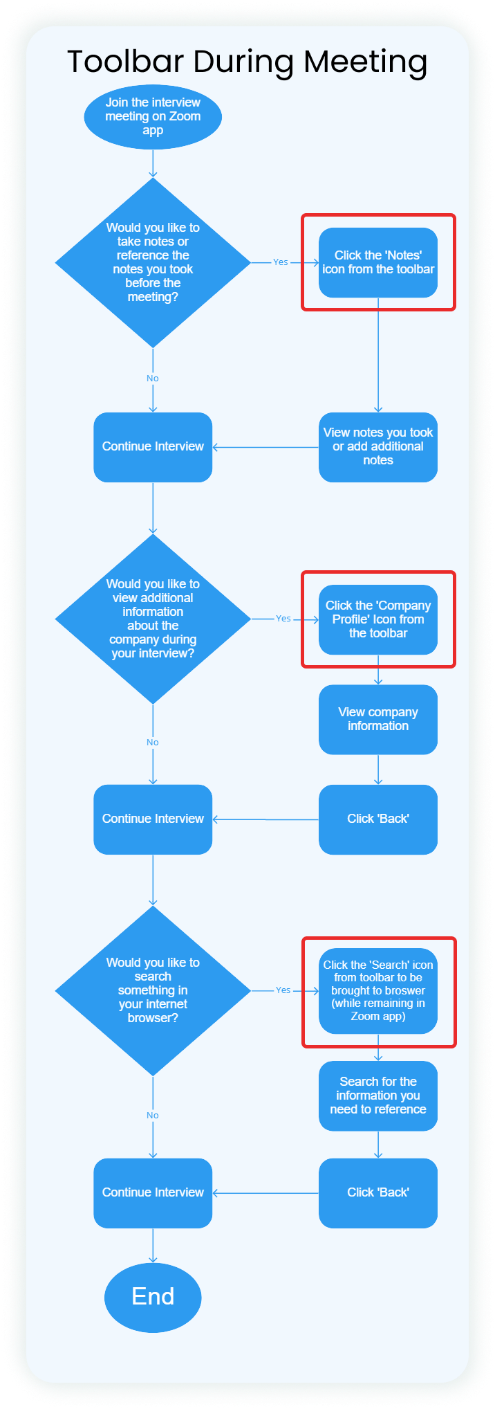
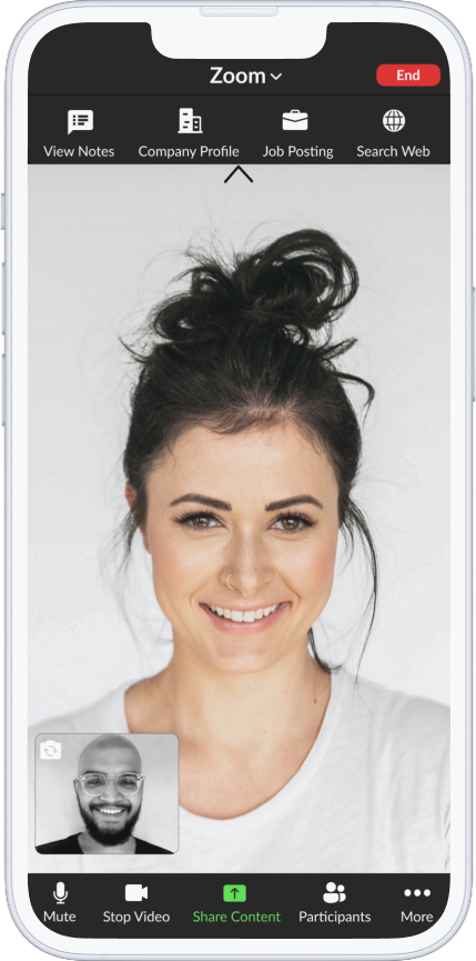
2. A menu within the Zoom video call that gives candidates the ability to reference notes they took before the meeting, take additional notes, view the company profile or job description, and search the web from the app.
The steps called out above represent different actions users can take before their interview to prepare.
The actions highlighted here represent functionality users can access during their interview.
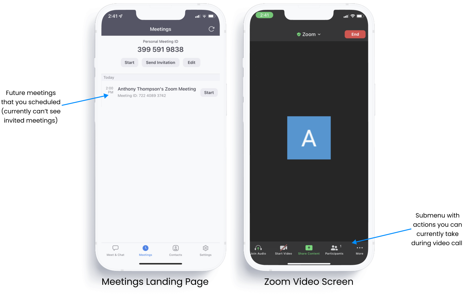
ZOOM’S CURRENT FUNCTIONALITY
SKETCHING AND WIREFRAMING
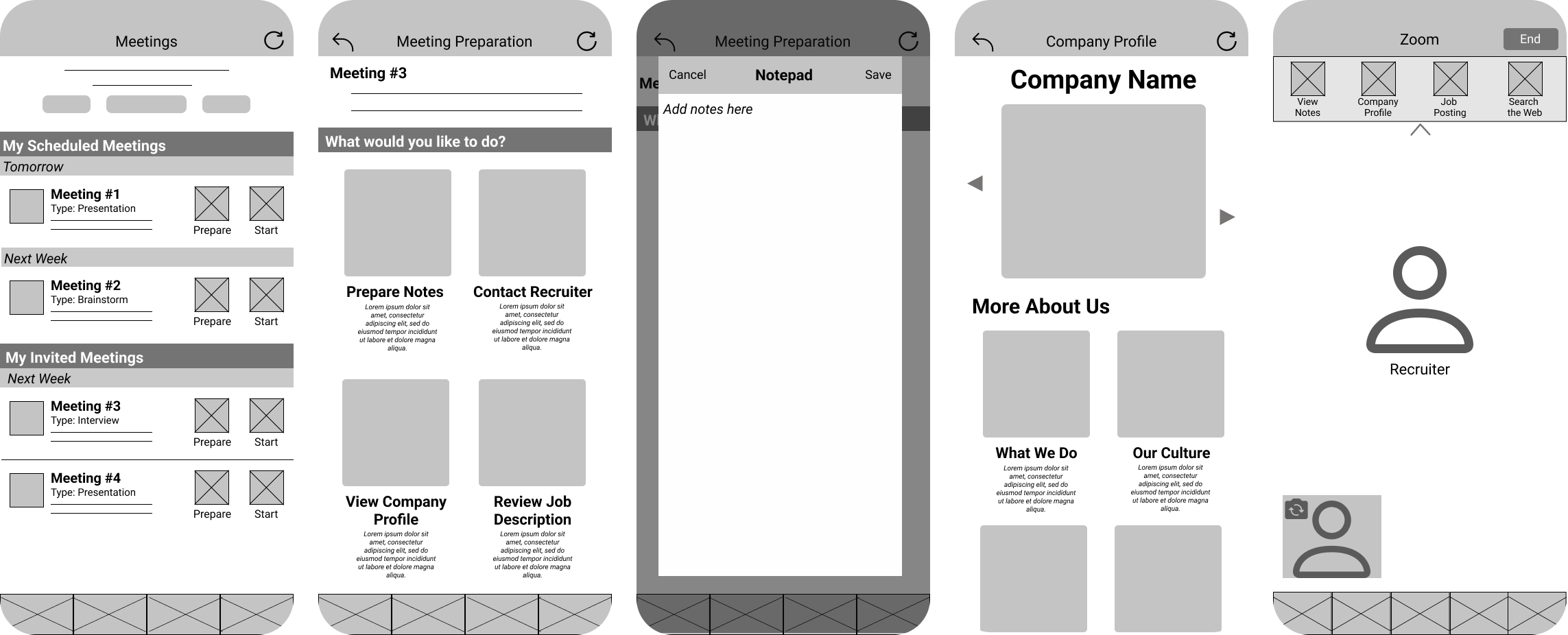
From there, I began sketching out workflows and developing mid-fidelity wireframes.
Sketches
Low Fidelity Wireframes
Mid-Fidelity Wireframes
GATHERING FEEDBACK: USABILITY TESTING
What we Tested
Using the prototype above, 3 usability tests were conducted to gather feedback on the new features. Users were asked to complete the following two tasks, with the goal of completing them both in under three minutes total:
Quantitative Results
Quantitative Results
HIGH-FIDELITY ITERATION AND NEXT STEPS
High-Fidelity Wireframes
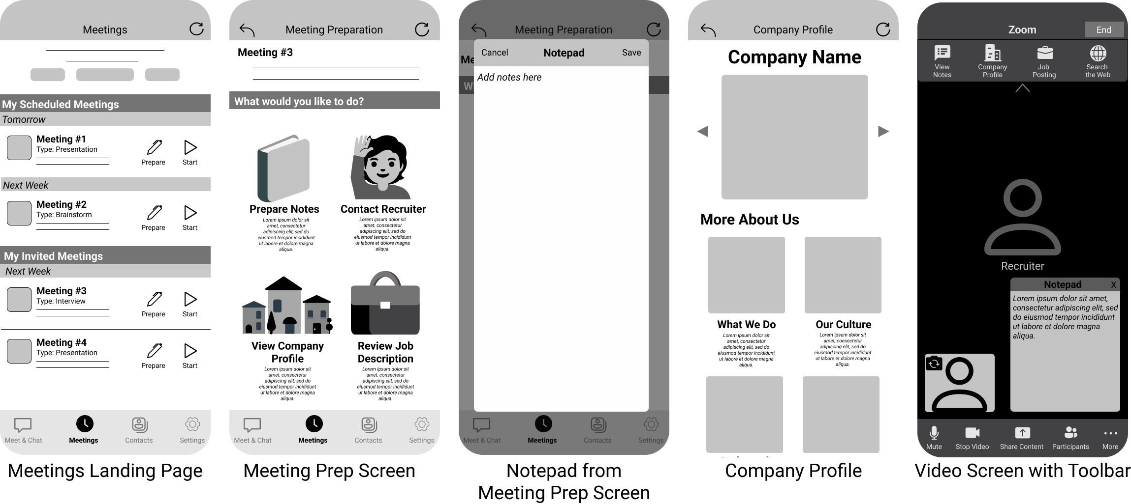
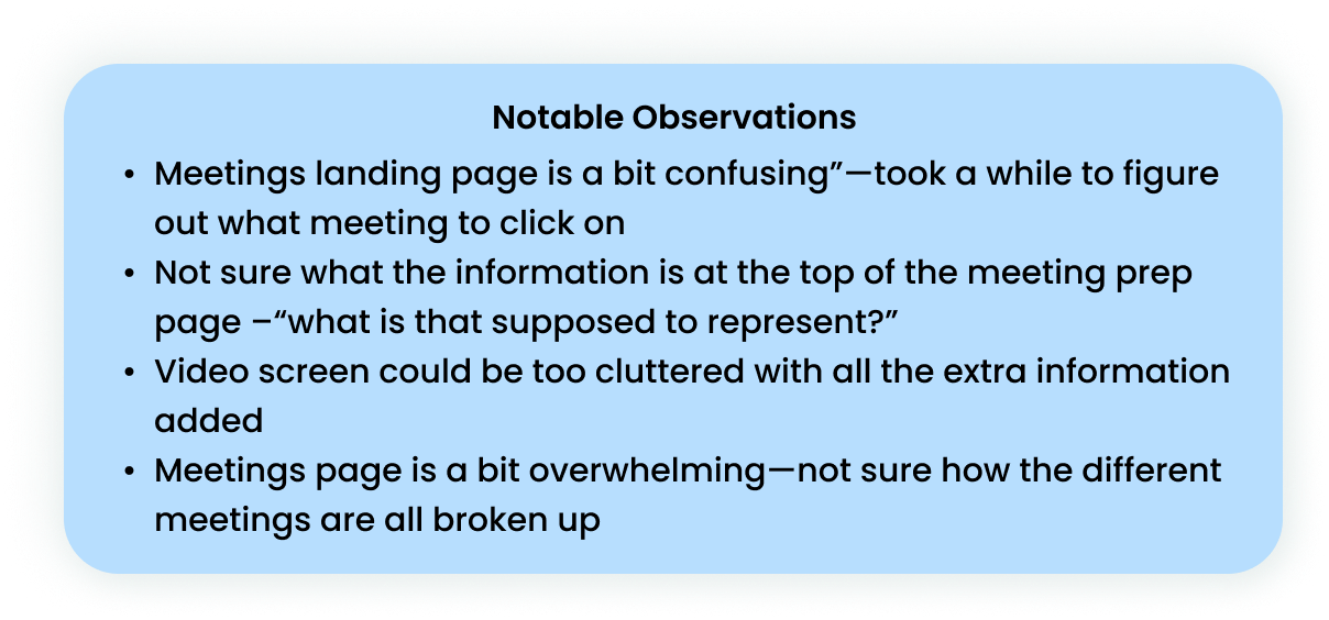
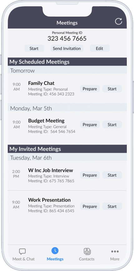
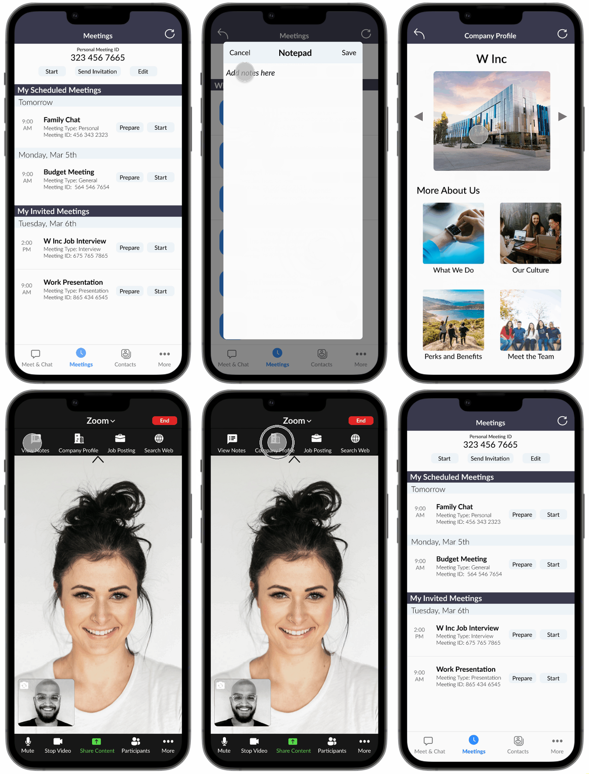
Based on the feedback of the usability testing, I moved forward and developed some high-fidelity wireframes that you can see below. The main change was redesigning the meetings prep page to be more inline with the current Zoom design—I used simpler visuals/iconography and switched the available options from a list to a grid view.
Meetings Page
New Meeting Prep Screen
Notepad from Meetings Prep Screen
New Company Profile Screen
Video Screen with New Resources Menu at the Top
Video Screen with Notepad Open
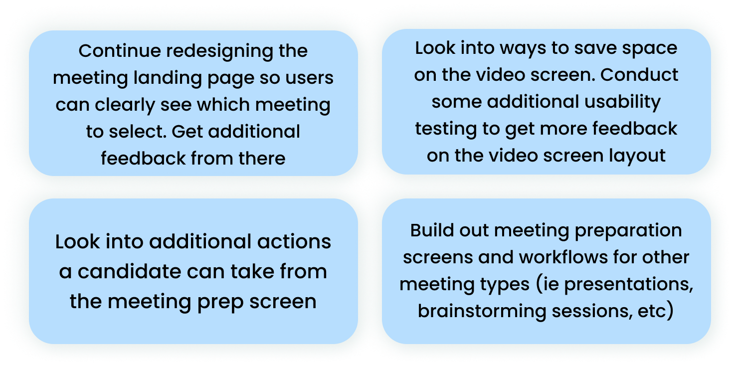
Next Steps
After finishing up the final wireframes, I determined some potential next steps to take on this project:
FINAL PROTOTYPE
You can watch a prototype of the proposed meeting prep screen and toolbar below:
Now try it out for yourself by clicking through the interactive prototype below:
FINAL THOUGHTS AND LESSONS LEARNED
This was the first project I worked on in the General Assembly UX boot camp, and from it I was able to gain a solid foundation of the UX process, conducting research/interviews, and creating designs using Figma. One of the main lessons I learned from this project was the importance of keeping a company’s brand and design system at top of mind throughout the UX process. In my initial mid-fidelity wireframes, I developed the meeting prep screen with whimsical, detailed iconography. While this may not have looked terrible on it's own, it didn’t match Zoom’s brand or image, which was much more clean and simplistic. I ended up re-designing the screens to better match Zoom’s current layout, and was much more satisfied with the results. Moving forward, I will make sure to carefully research a client’s brand identity and design system, and make sure to not stray from those when designing.
Thanks so much taking time to review this project! If you’d like to see more, you can check out some of my other work here:


