Minimol: A Health-Tracking Mobile App for Individuals with Pre-Diabetes

Project Overview
THE WHAT
This was a project I completed for the company AMP Health, a health-tech company with the goal of decreasing the prevalence of chronic health conditions. In this partnership, I provided research and design assistance with Amp’s Minimol product, which is a mobile health tracking app geared towards individuals with pre-diabetes.
THE WHO
I worked along with two other designers as a UX researcher and designer through the entire end-to-end process, and was heavily involved in every stage of the process, from user interviews to problem development to design and iteration. I also collaborated with the CEO and CTO from AMP Health throughout the lifecycle of the project.
THE WHEN
This project occurred over a three-week sprint during April and May 2022.
THE WHY
Diabetes is the #1 most common non-communicable chronic illness, both in the world and the US, and almost 30% of adults in the US have pre-diabetes. Minimol’s mission is to provide support to individuals with pre-diabetes, with the ultimate goal of decreasing the rate at which a pre-diabetes diagnosis leads to full diabetes. The company is currently working on a beta launch of Minimol for pre-seed funding, and that’s where Saira, Russel, and I stepped in with the goal of providing a fresh design perspective and to create prototypes for a few different Minimol workflows.
THE HOW
Over a three-week period, we ran an end-to-end process starting with business and user research, and ending with a high-fidelity prototype.

Research and Problem Synthesis
COMPANY BACKGROUND: AMP HEALTH
Who is AMP Health?
AMP Health is a start-up health technology company founded last September, with a mission of preventing 10 million people from developing chronic diseases in the next 10 years. To achieve this, AMP is focusing on building mobile products that use validated behavioral psychology techniques – these techniques help to encourage realistic goals, remind users that failing is part of the process, and work to achieve lasting behavior change.
AMP’s Minimol Product
AMP’s first product they are releasing to the market is called Minimol, a mobile iOS platform geared towards individuals with pre-diabetes, a medical diagnosis characterized by higher blood sugar than normal, but not yet high enough for a full diabetes diagnosis. At a high-level, Minimol is a digital health companion, similar to other health/diabetes tracking apps like MyFitness Pal or One Drop where users can log meals and exercise, import health data, and set health-related goals. However, Minimol has plans for several key features that will set them apart from other players in the market:
Why Focus on Pre-Diabetes?
After learning a bit more about AMP Health and Minimol, we wanted to do some research on the larger problem of pre-diabetes, and why AMP chose this as the first chronic condition they wanted to focus on. Below are some statistics that indicate the importance of focusing on the prevention of diabetes and pre-diabetes:
BUSINESS RESEARCH: THE CURRENT MARKET
After learning more about AMP Health, Minimol, and the problem they were trying to solve, we turned our focus to other competitors on the market. We looked at both general health-tracking apps as well as diabetes/disease-management apps, and compared their current features with what Minimol is looking to offer. Below is a competitive analysis we conducted of Minimol and four other health iOS apps:
USER RESEARCH
In addition to conducting 2 informational interviews with the AMP Health team, we also conducted a total of 6 user interviews and gathered 34 survey participants. We asked participants about their experience with different health tracking apps (ie Noom, MyFitness Pal, One Drop, etc), and dug into what they found enjoyable as well as frustrating about them. We also inquired about user motivations for using a health-tracking app and if applicable - what factors led them to stop using the product.
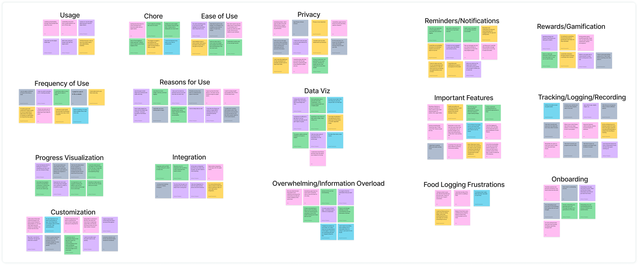
Below you’ll find the affinity map we created based on our research. This allowed us to find themes and commonalities among the interview feedback we received. The different color post-it notes represent the 6 different interviewees.
From the affinity map above, we developed “I statements” that represented common patterns we observed in the data. The following are some of the more prominent themes that emerged from our interviews:
I want an app that uses automation when possible so there is less manual work I need to do.
I want customization options so I can choose settings that best work for me.
I care about the privacy of my data, and want an app to take measures to ensure it’s protected.
I don’t want to use a product that is overwhelming or difficult to keep up with, as I feel discouraged when I’m unable to keep up with the work.
I want the app to use my preferences/data to create a personalized and tailored experience that best matches my lifestyle.
DEVELOPING A PERSONA
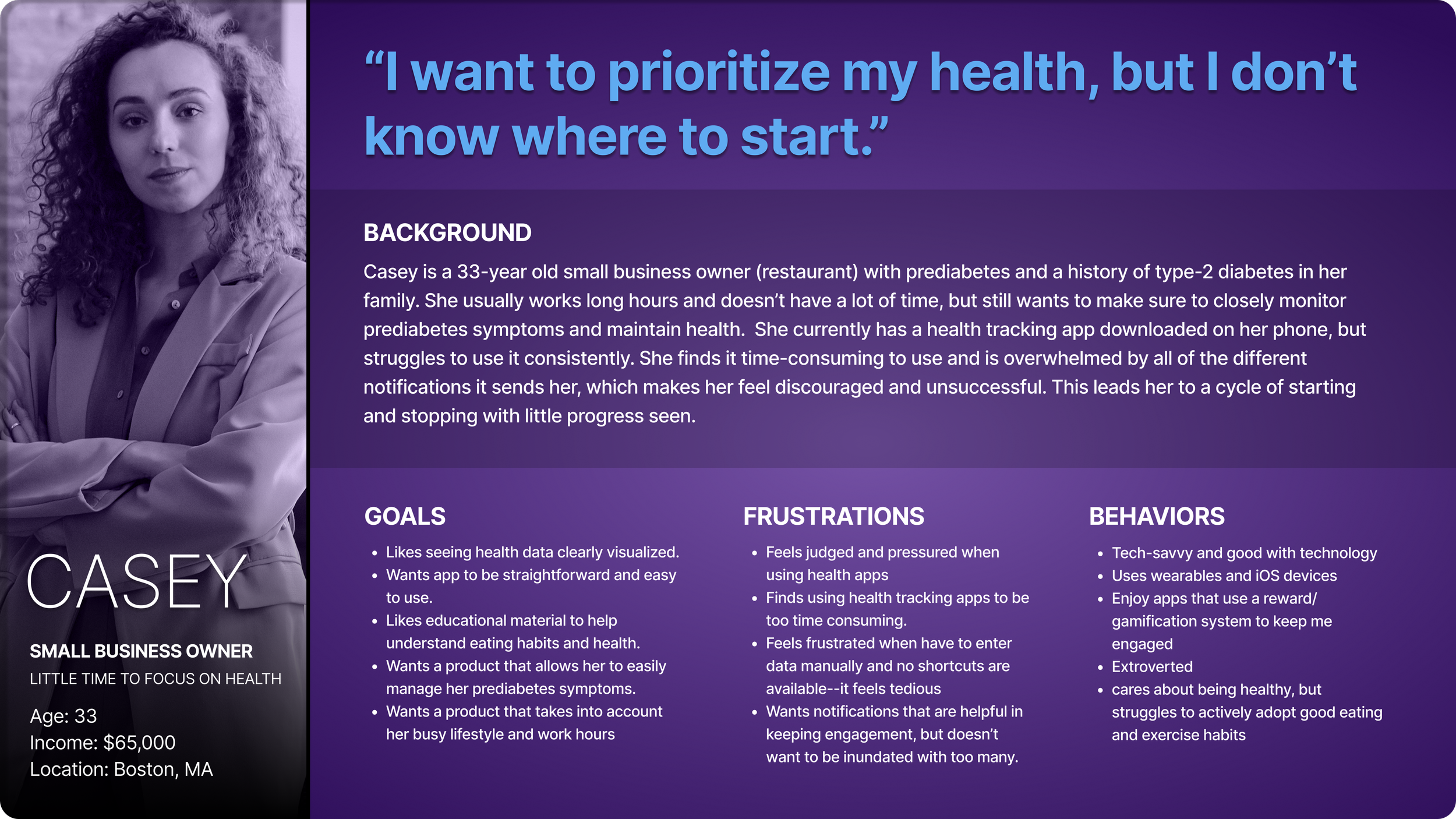
Based on the findings from our user interviews, I developed the following persona, Casey, to represent Minimol’s target user:
MAPPING THE USER’S JOURNEY
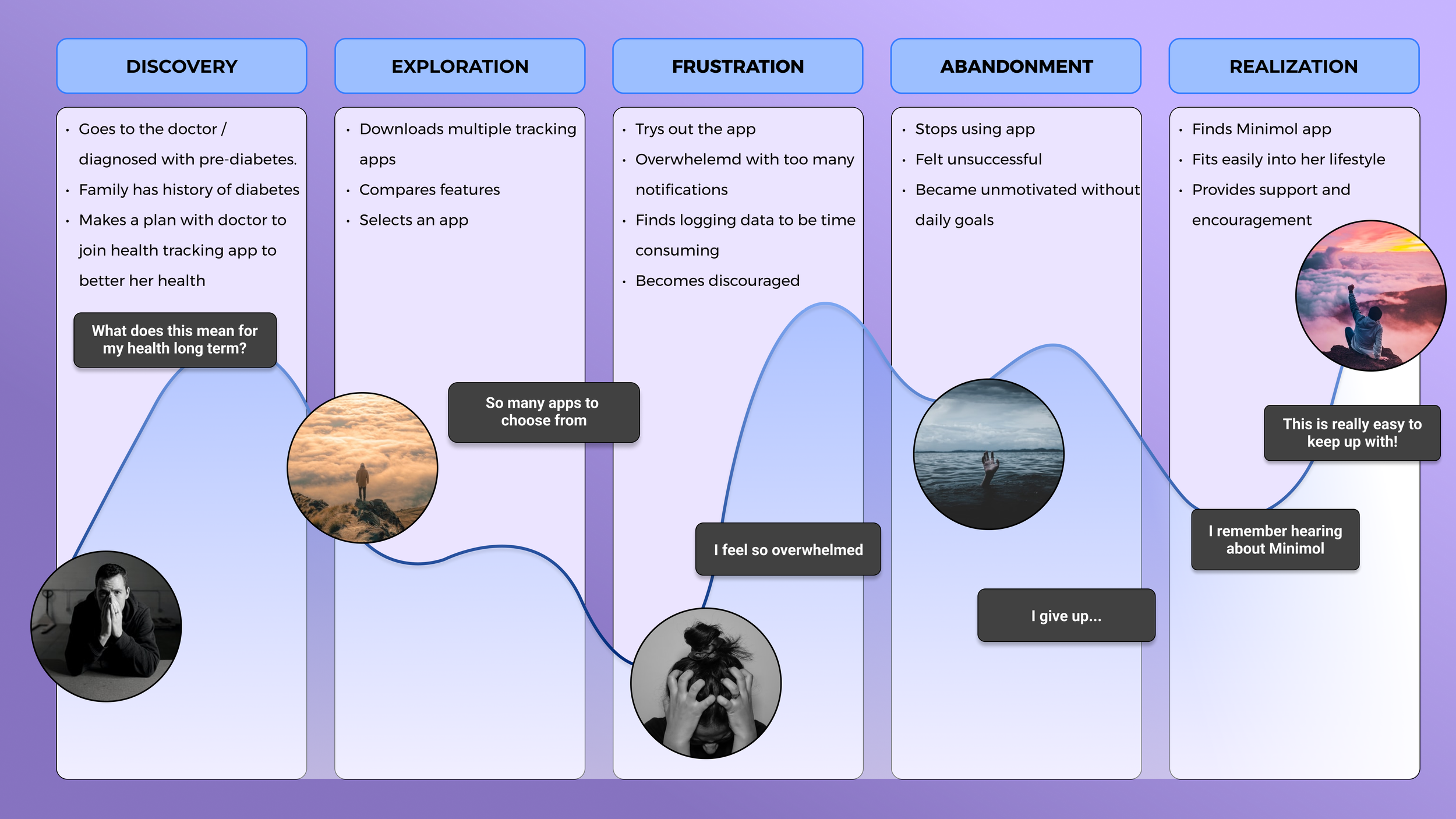
After developing our persona, we created a journey map for Casey to get a better sense of her experience with pre-diabetes health tracking:
THE PROBLEM WE WANT TO SOLVE
With the problem statement defined, we moved onto the design and delivery phases. Based on our research and conversations with the AMP Health team, we decided to focus on designing the main home screen/dashboard and onboarding screens and workflows. We thought focusing on these heavily-trafficked areas would give us the best chance to showcase a personalized and visually approachable experience for Casey.

Website Structure and Design
USER FLOWS
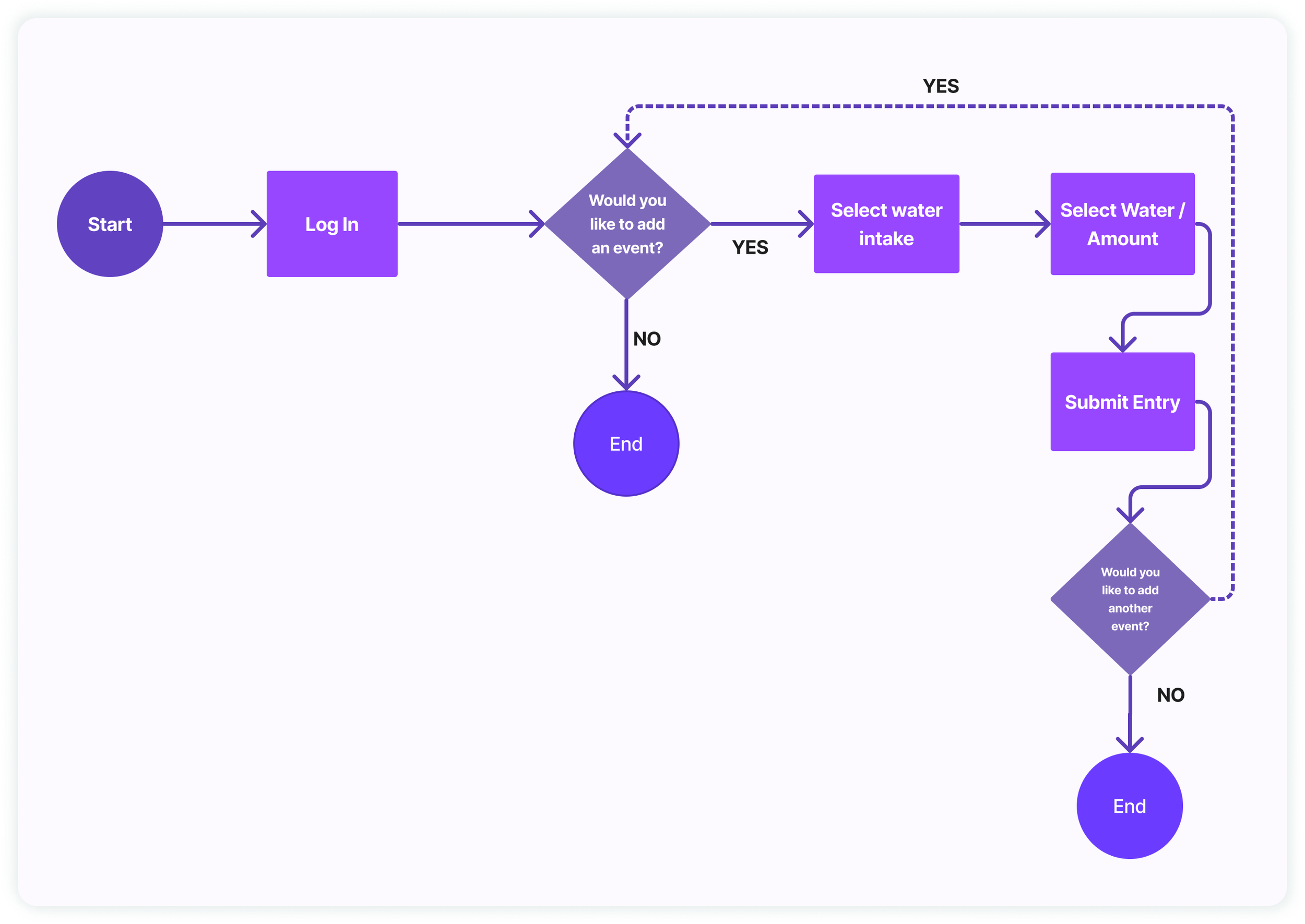
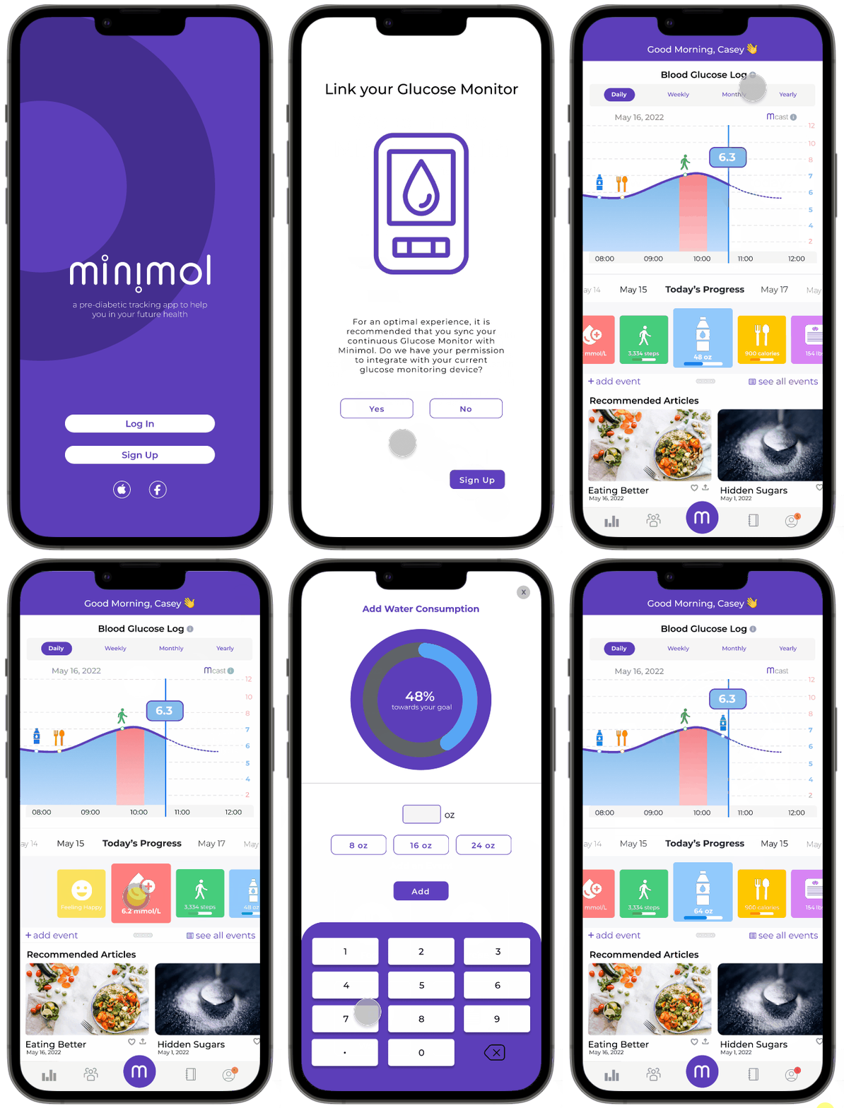
After determining the features we wanted to focus on, we set out on creating user flows to get a better idea of how Casey would complete specific workflows. The first user flow below highlights the process of adding an event to the daily tracking log from the main dashboard screen:
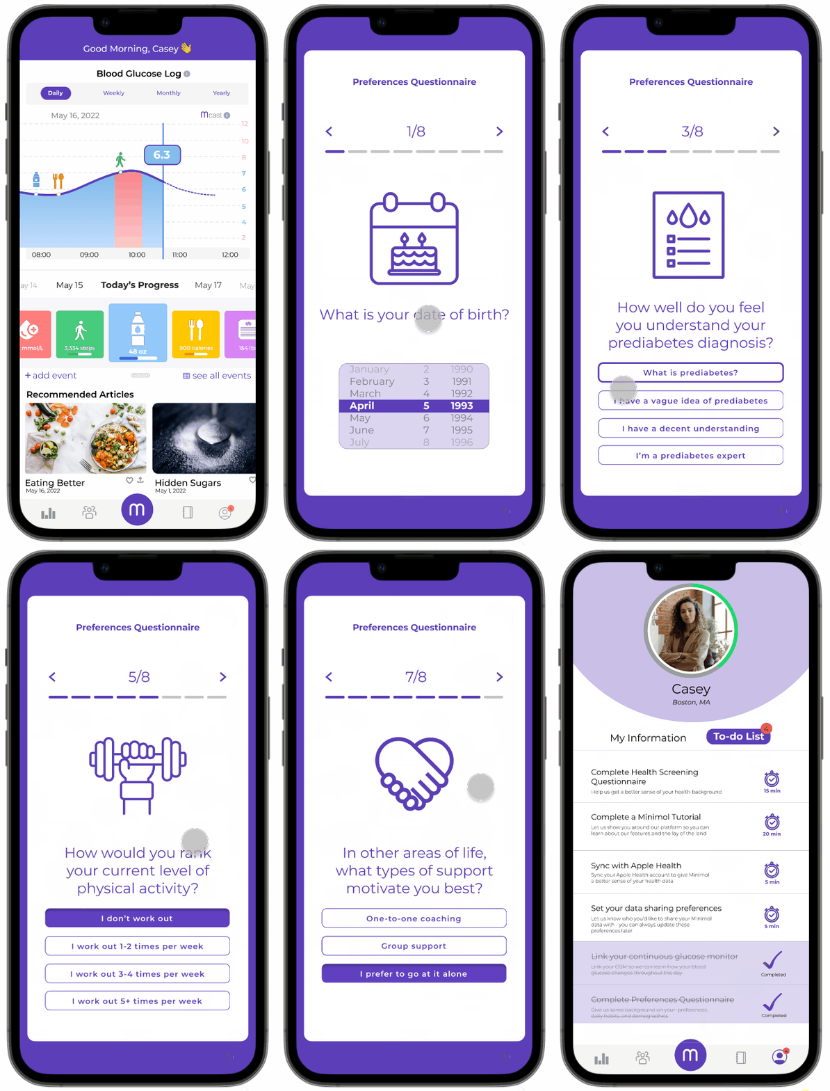
The next flow shows the process of a user navigating to their profile and completing an onboarding questionnaire:
SKETCHING AND WIREFRAMING
From there, we began sketching out workflows and developing mid-fidelity wireframes.
Sketches
Main Dashboard/Event Log
User Profile
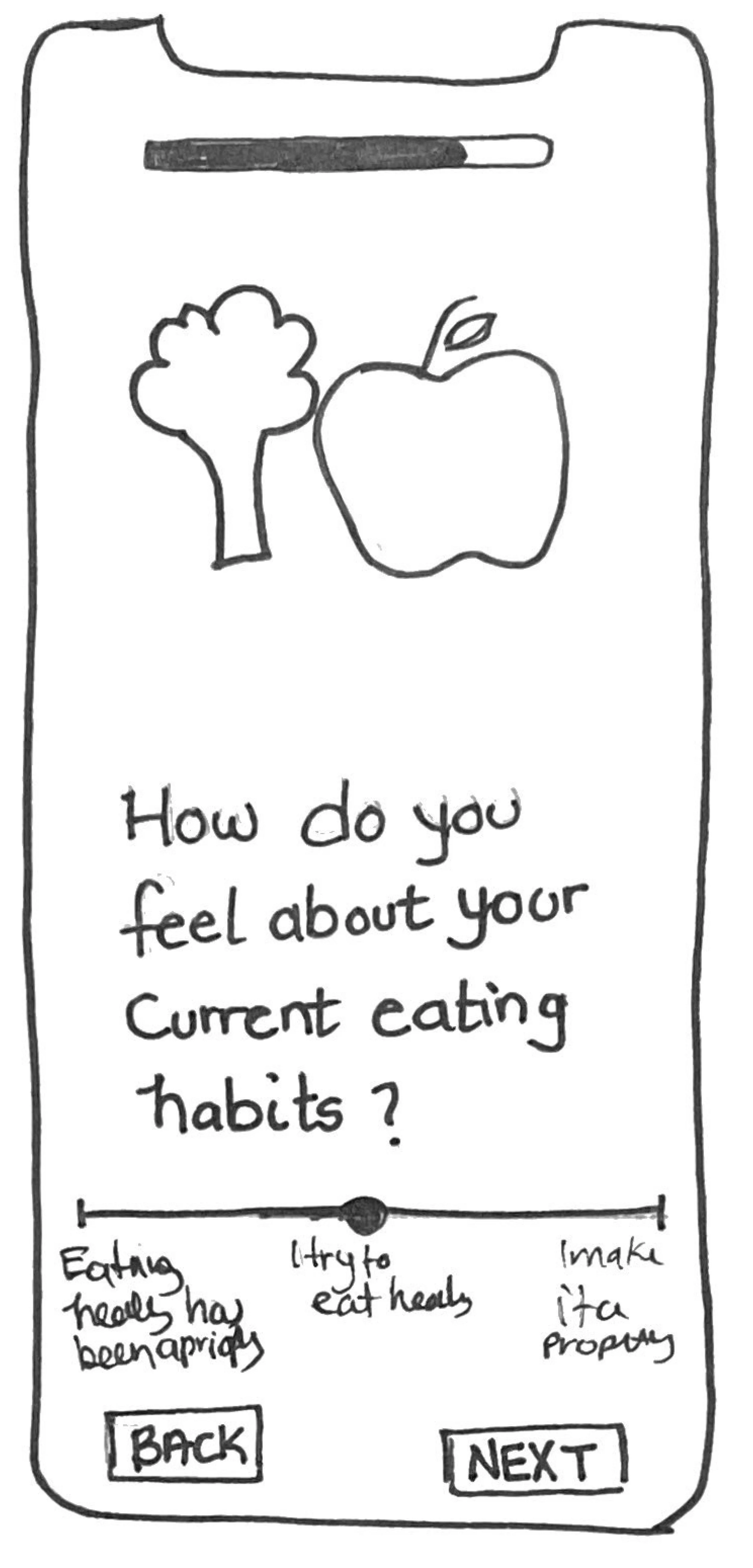
Onboarding Questionnaire Screen
Mid-Fidelity Wireframes
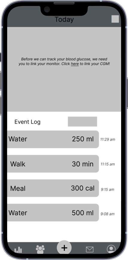
Main Dashboard/Event Log
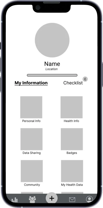
User Profile
Onboarding Questionnaire Screen
DESIGN SYSTEM
The Minimol Brand
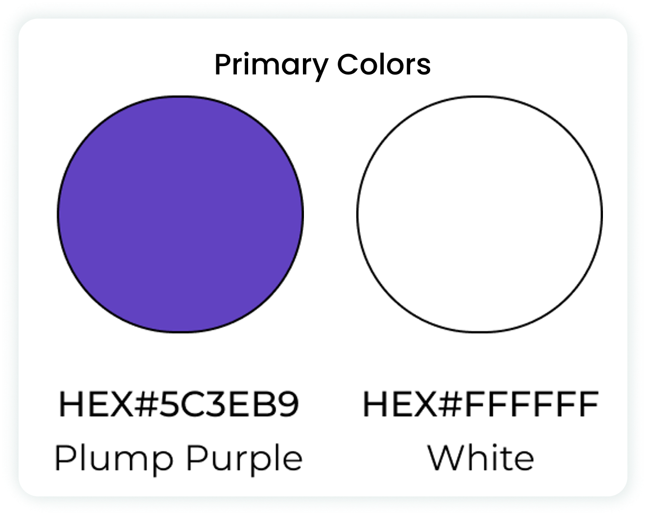
When meeting with the owner and CTO of AMP Health, they discussed the importance of the color purple within their brand. They mentioned that purple is a balance color between red and blue (red is stimulation, blue is calm), and Minimol really wanted to represent that same balance in their product. In this case, the Minimol brand wants to strike a balance between hard-core, data-driven analytics and an approachable, easy-to-understand interface. Based on these conversations, we chose a shade of purple as the primary color in our design, with simple blacks, whites, and greys as secondary colors.
It was also important to the team to have simple, clean iconography and messaging to make sure that the product was not overwhelming to users. Because of this, we chose a sans-serif typography and simple line iconography.
Which Shade of Purple to Choose?
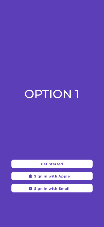
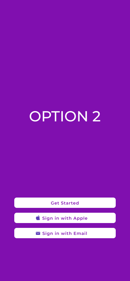
As we were developing our design system, we narrowed our primary color options down to two different shades of purple but were having trouble choosing one. For some help, we decided to take a poll of various classmates, peers, and social media contacts. With 109 total responses, 84% preferred option one below, while 16% preferred option 2. From these conclusive results, we decided to move forward with option 1, Plump Purple, as our primary color.
HIGH-FIDELITY WIREFRAMES
After completing mid-fidelity wireframes and narrowing down our design system, we moved forward to creating high-fidelity wireframes that you can see below:
Main Dashboard
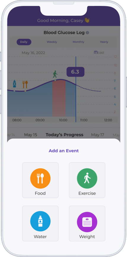
Visual of the Minimol Dashboard, which is the landing/home page for users and what they see when they first log in
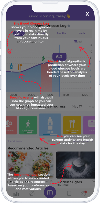
Informational overlay to help users get acclimated to the content on the dashboard
Daily Pulse check feature that provides an insight to a user’s engagement level
Overlay to log an event (food intake, exercise, etc.)
Onboarding/User Profile Screens
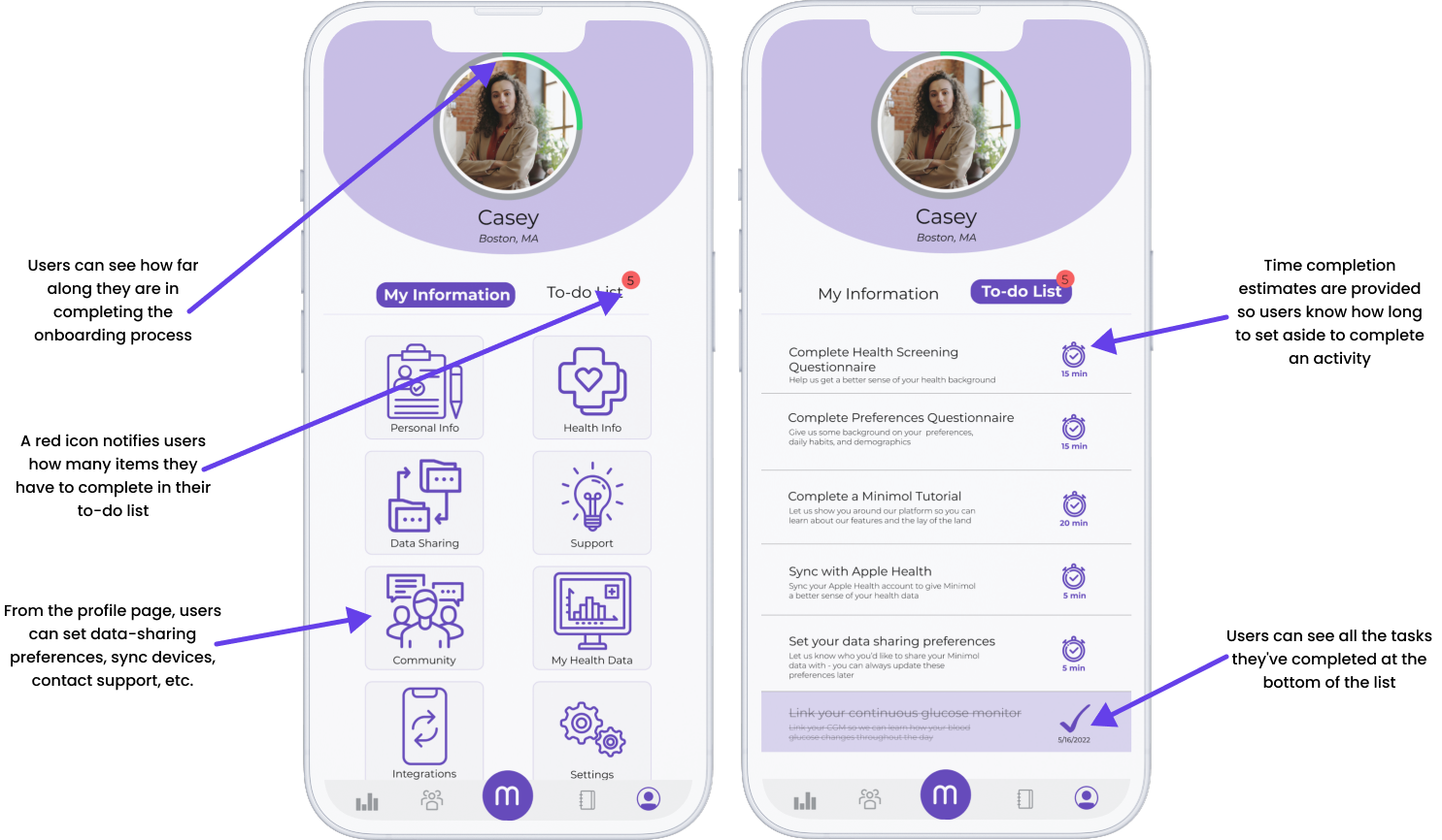
The User Profile and Checklist screens, where users can complete onboarding activities, set preferences, contact support, etc. Users can navigate to this screen by pressing the profile icon on the right side of the sub-menu.
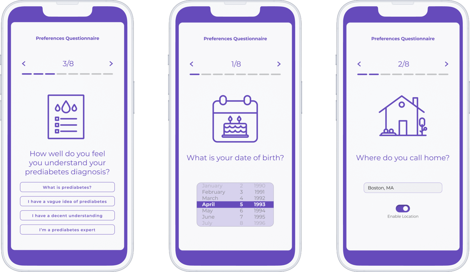
Sample Onboarding Questionnaire Screens
GATHERING FEEDBACK: USABILITY TESTING
What we Tested
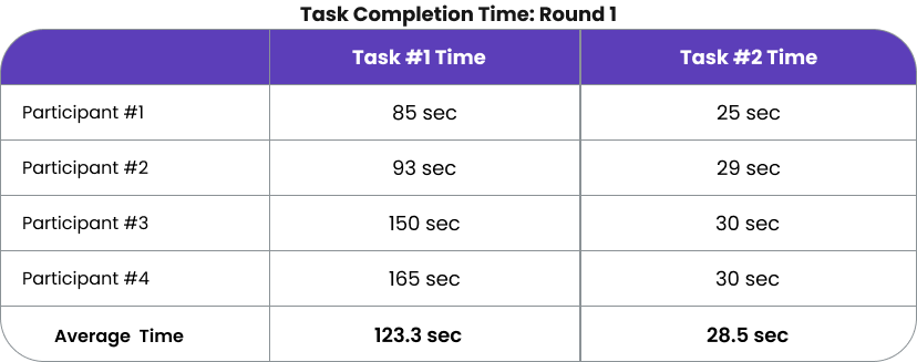
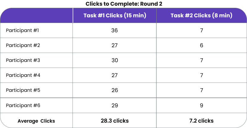
Two rounds of usability testing were completed, one after creating our mid-fidelity prototypes and one after the first high-fidelity iteration. 10 participants total (4 in the first round, 6 in the second) participated and provided feedback on the features. Users were asked to complete the following two tasks, with the goal of completing task #1 in less than 120 seconds and 30 clicks and task #2 in less than 1 minute and 8 clicks.
Quantitative Results
Qualitative Results
Based on these results, we decided to focus on the user dashboard as users seemed to have a bit more trouble with that screen. In the next section, you can see the changes we made based on usability testing feedback.
FINAL ITERATION
Based on usability testing results, we made a few small changes to our design to hopefully help ease some of the concerns mentioned. While time was limited and we weren’t able to make any substantial changes, we definitely want to conduct additional testing when time allows to see if any other iterations need to be made.
PROTOTYPE
Below are prototypes of our final designs for both logging an event from the dashboard and completing an onboarding questionnaire from the user profile:
Viewing Dashboard and Logging an Event
Completing an Onboarding Questionnaire
NEXT STEPS
While our project ended here, we identified the following next steps that would be beneficial to address when picking up the project again:
CHECK IT OUT FOR YOURSELF!
You can try the interactive prototype of our work below:
FINAL THOUGHTS AND LESSONS LEARNED
As this was the first client project I’ve worked on, I feel I grew immensely from this project. I not only gained experience building rapport with clients and communicating effectively, but also in designing with brand identity in mind. This project also re-solidified an interest in healthcare tech and design, as it was motivating and rewarding to work within such a high-impact and important industry. Moving forward, I’d like to continue improving and honing my client communication skills, making sure I’m asking the right questions and always keeping company brand in mind through each step of the process. I’m excited for the next opportunity to work with a client so I can provide them with quality work and continue growing my skills.
Thanks so much taking time to review this project! If you’d like to see more, you can check out some of my other work here:


