Green Corner Grocery: E-Commerce Redesign

Project Overview
THE WHAT
This was a project I completed with the goal of improving the e-commerce experience for a locally-owned grocery store in New York City.
THE WHO
I worked individually as a UX researcher and designer through the entire end-to-end process, and was involved in every stage of the process, from user interviews to problem development to design and iteration.
THE WHEN
This project occurred over a three-week sprint during March and April 2022.
THE WHY
Due to the COVID pandemic in 2020, e-commerce has boomed across many markets, and the grocery industry is no exception. According to a December 2020 article from Forbes, online grocery sales increased from $1.2 billion in August 2019 to 7.2 billion in June 2020. During that same time period, the number of online customers also increased from 16.1 million to 45.6 million (source: Forbes). Even with things starting to return to ‘normal’, online shopping for a variety of goods, including groceries, is here to stay. With this shift, customers still want to be able to have the same experience shopping online as at a brick-and-mortar store in person—they want to be able to get a tangible sense of the products they are purchasing and feel confident that they are buying the right product for themselves. It is within this context that I approached my research and design work.
THE HOW
Over a three-week period, I ran an end-to-end process starting with business and user research, and ending with a high-fidelity prototype.

Research and Problem Synthesis
BUSINESS RESEARCH: THE CURRENT MARKET
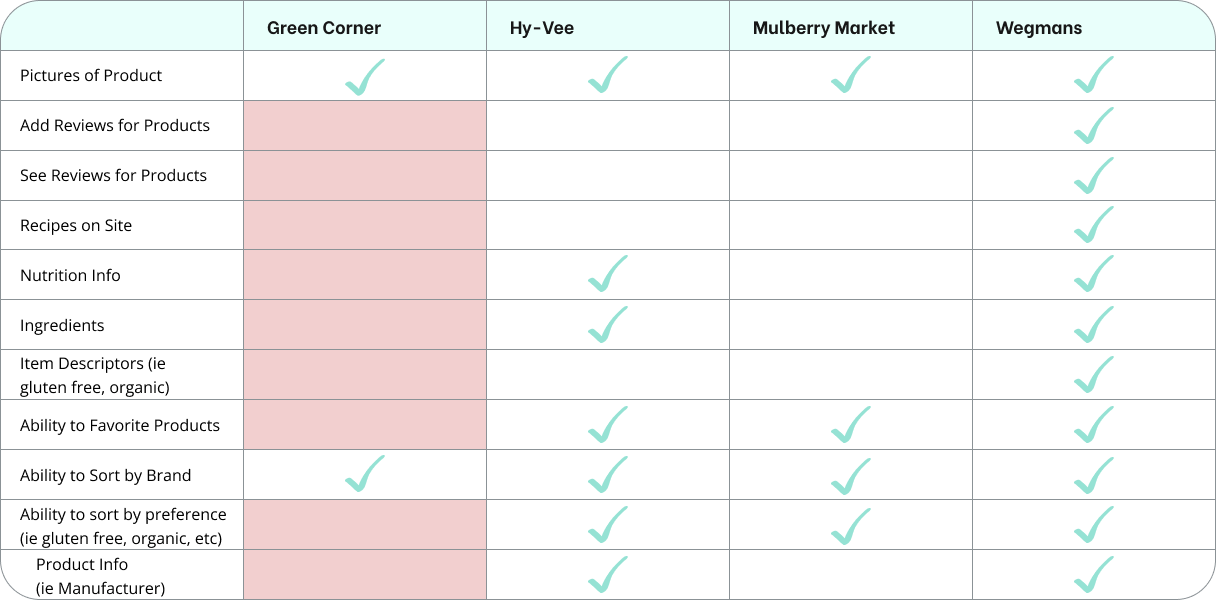
I first wanted to focus on other businesses in the grocery e-commerce space, to get an idea of the current state of the market. In the grocery industry, I decided to compare Green Corner to HyVee and Wegmans, 2 larger regional grocery stores, as well as Mulberry Market, another small business in NYC. Below is a feature inventory that compares Green Corner to the online shopping experience of these other retailers:
From this feature inventory, we can see that Green Corner currently doesn’t stack up to competitors in the e-commerce space. Wegmans offers the most comprehensive online shopping experience for those who want to look at product information and reviews, as well as leave reviews for products they’ve purchased. Mulberry Market, another small grocery business in New York City, doesn’t have as many features as the larger retailers, but still currently provides more offerings than Green Corner
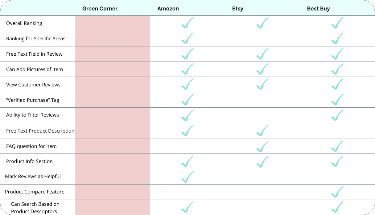
I also wanted to get a better sense of what features other large non-grocery e-commerce companies offer. I conducted the following competitive analysis to see what features Amazon, Etsy, and Best Buy offer:
From this comparative analysis, we can observe that these sites all offer a great deal of product information for customers to review compared to Green Corner. They also allow customers to leave thorough, detailed reviews and provide them the ability to rank several aspects of the products they’ve purchased.
DEVELOPING A PERSONA
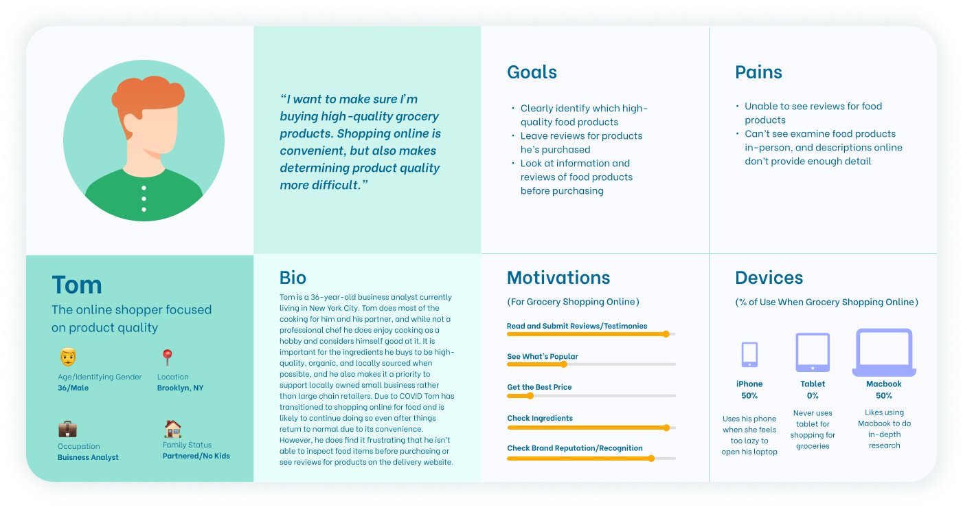
For this project, I was assigned an archetype to represent Green Corner’s target user. Based on characteristics of the assigned archetype, I created the persona below.
To summarize, Green Corner’s target user is primarily focused on quality. They want to make sure they are purchasing the best products, and are interested in doing as much research as possible to ensure confidence in their purchase. Brand loyalty is also important to them - once they find a top-quality product they enjoy, they are likely to continue purchasing it.
MAPPING THE USER’S JOURNEY
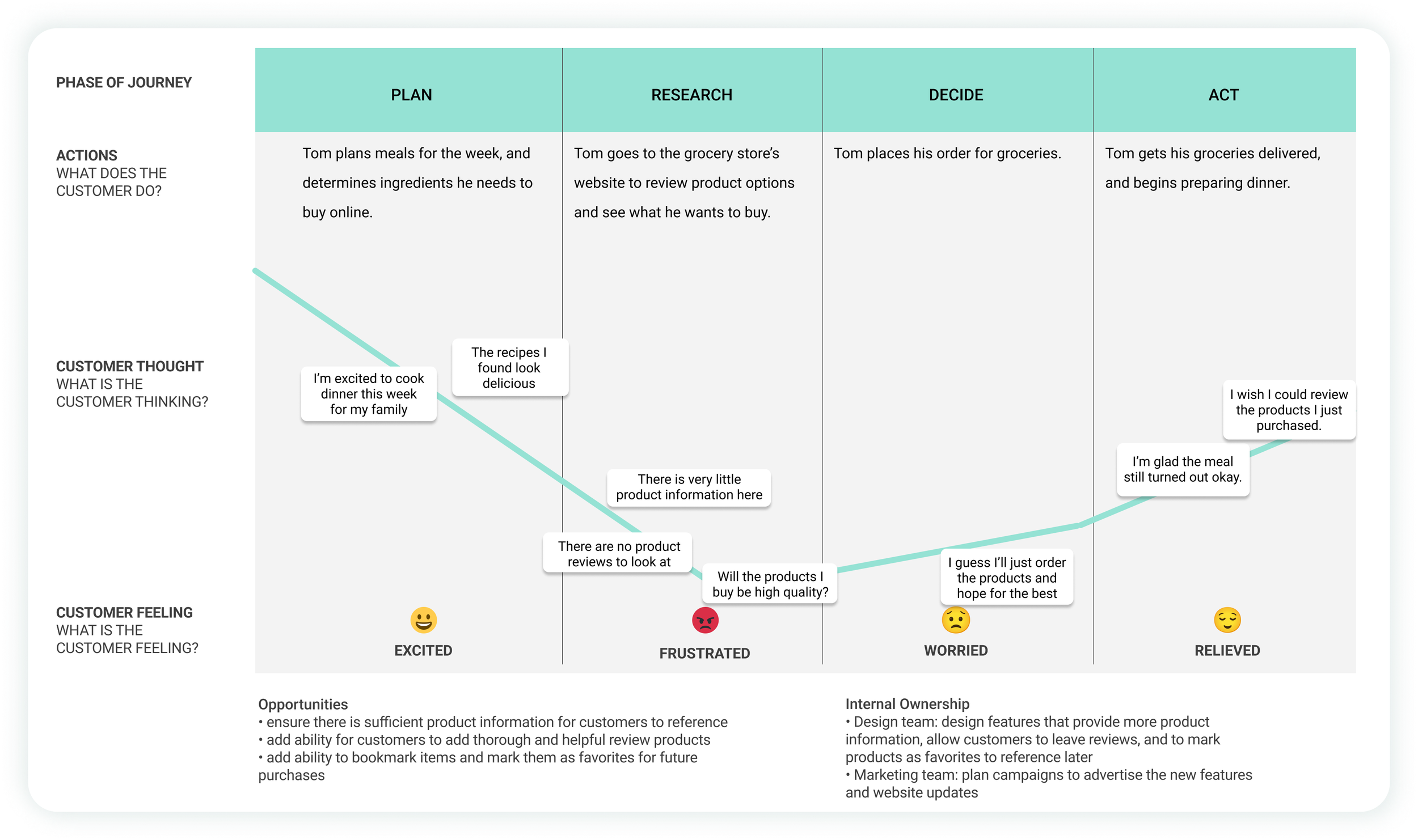
To get a better sense of Tom’s current frustrations with the Green Corner website, I created the following journey map based on the archetype to pinpoint potential areas of frustration in the current grocery-purchasing experience with Green Corner.
THE PROBLEM WE WANT TO SOLVE
With the problem statement defined, I moved onto the design and delivery phases. I decided to focus on redesigning the full shopping workflow and adding the ability to leave product reviews on Green Corner’s site.

Website Structure and Design
GREEN CORNER’S CURRENT WEBSITE
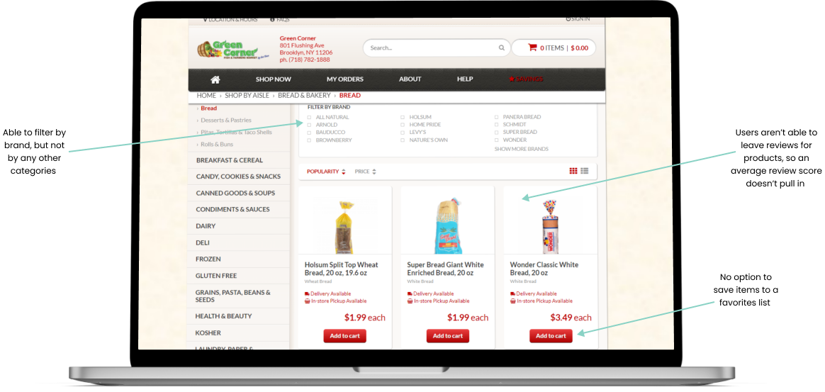
Below is a page from Green Corner’s current website. As you can see, filtering results is limited, which makes researching what items to buy more difficult. Users are also not able to leave reviews or save items to a favorites list for later. When viewing a specific product, relevant information such as nutrition facts and ingredients are not present.
A snapshot of the bakery department screen on Green Corner’s site.
INFORMATION ARCHITECTURE
Card Sorting
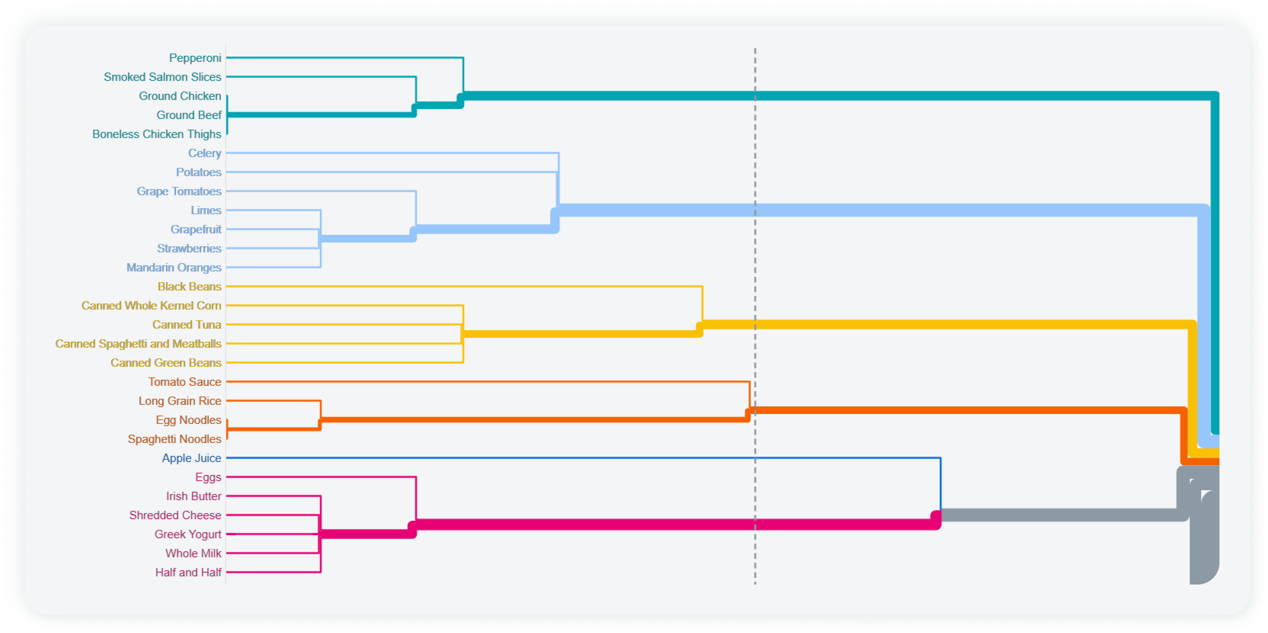
To help with the architecture of the website, I had 22 participants complete a card sorting activity in which they categorized 72 grocery store products into different categories. Below is a snapshot of a dendogram, which was used to help analyze the card sorting results.
Site Map
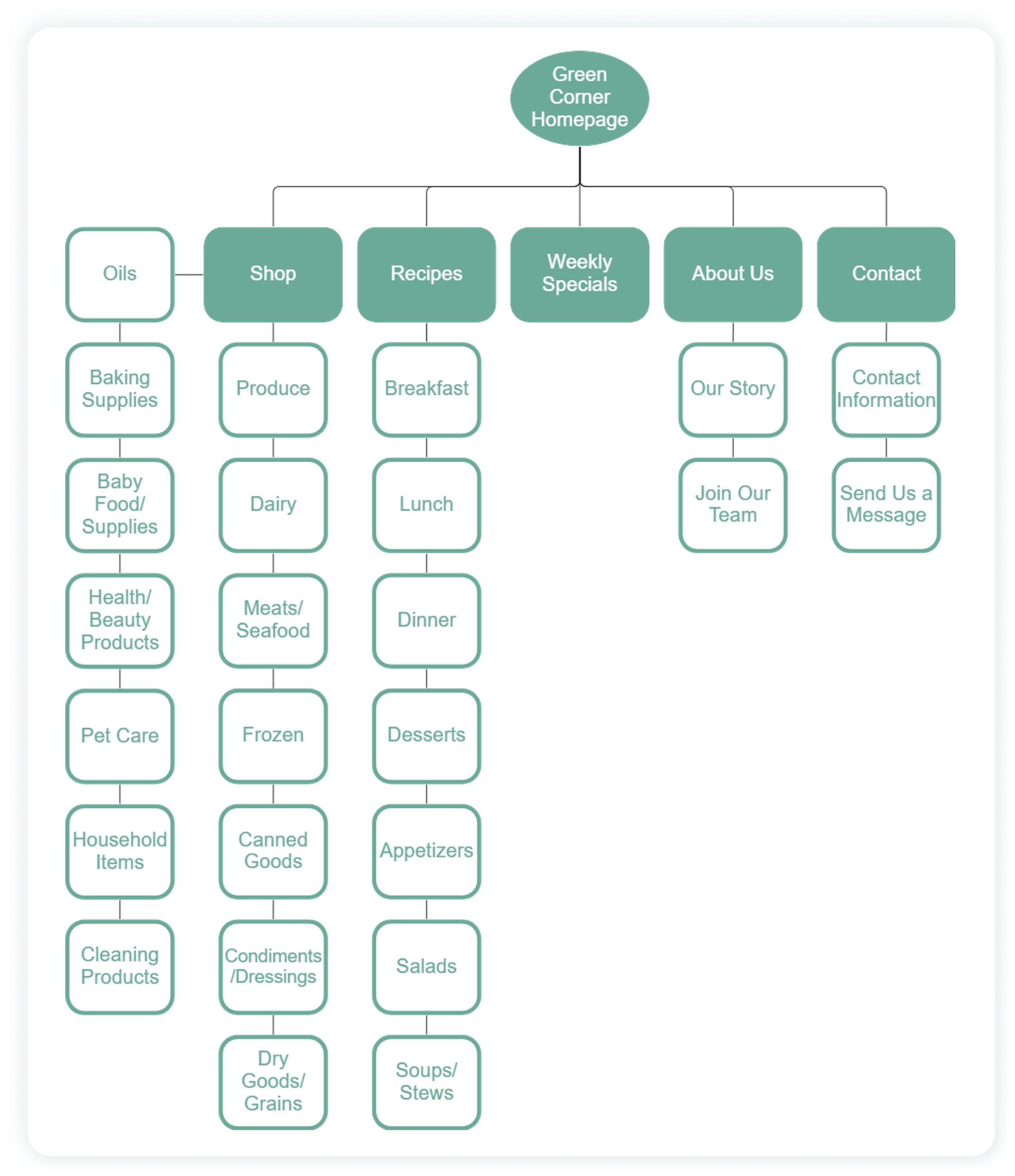
I then synthesized the card-sorting results and came up with a sitemap for the website. Based on the data, I decided to separate the products into 15 different departments on the website.
SKETCHING AND WIREFRAMING
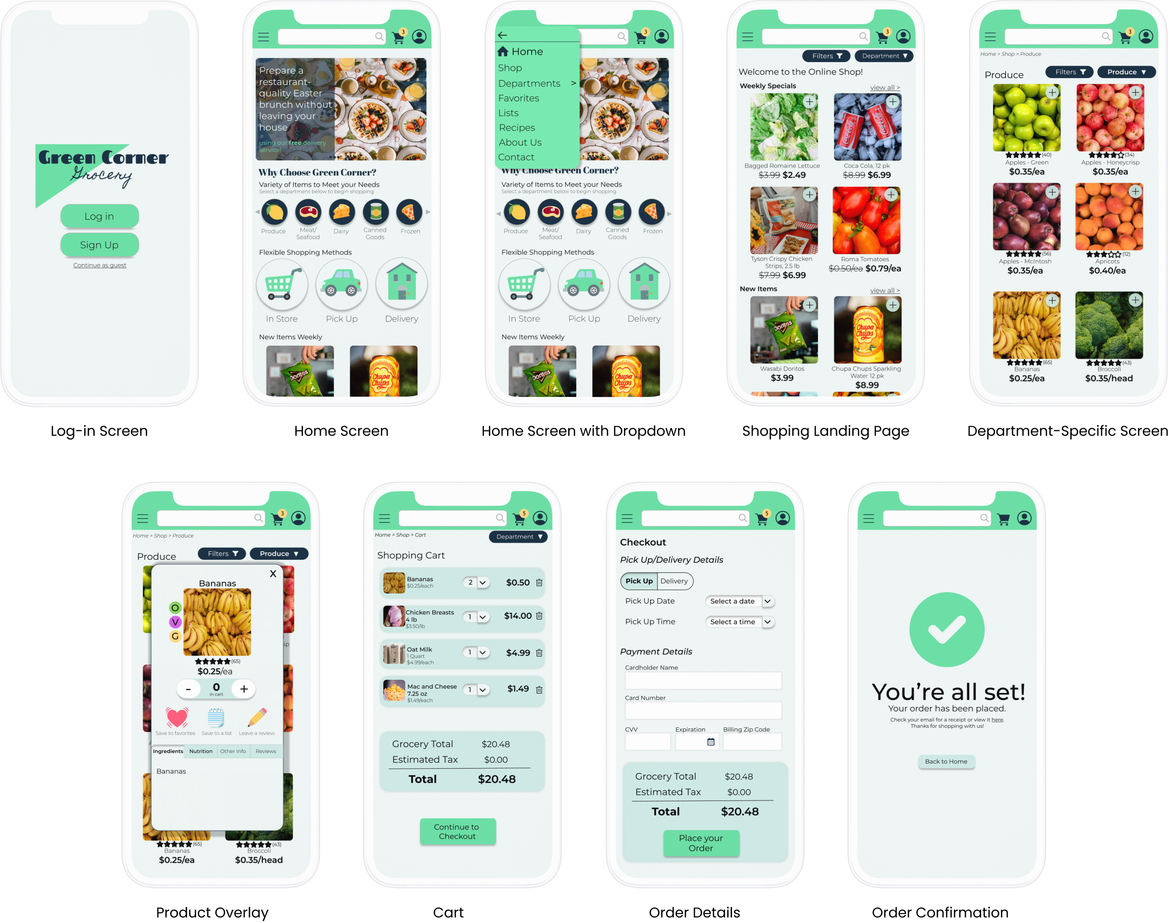
From there, I began sketching out workflows and developing mid-fidelity wireframes.
DESIGN SYSTEM
Typeface & Color Palettes
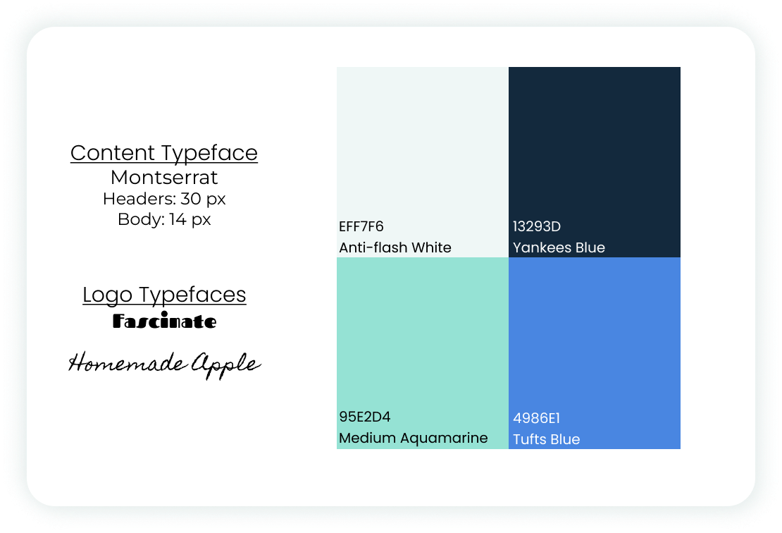
I chose the typefaces and colors to the left for their simplicity—given that this is a grocery website, I knew there would be a lot of product information pictures that take up a lot of visual real estate, independent of visual design elements. Therefore, I chose more muted elements that complement the product information rather than compete with them.
HIGH-FIDELITY WIREFRAMES: FIRST ITERATION
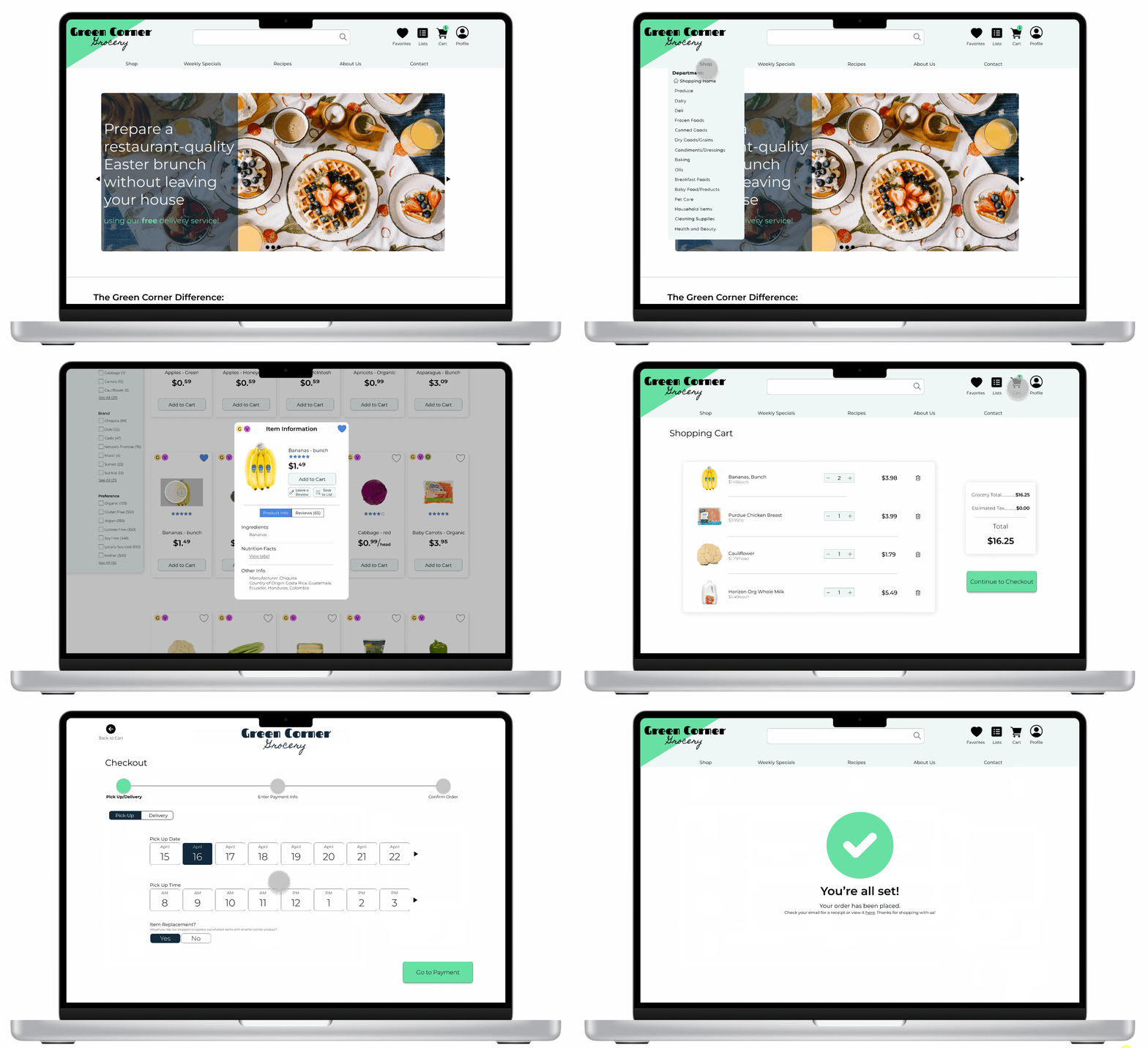
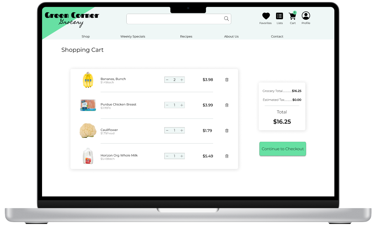
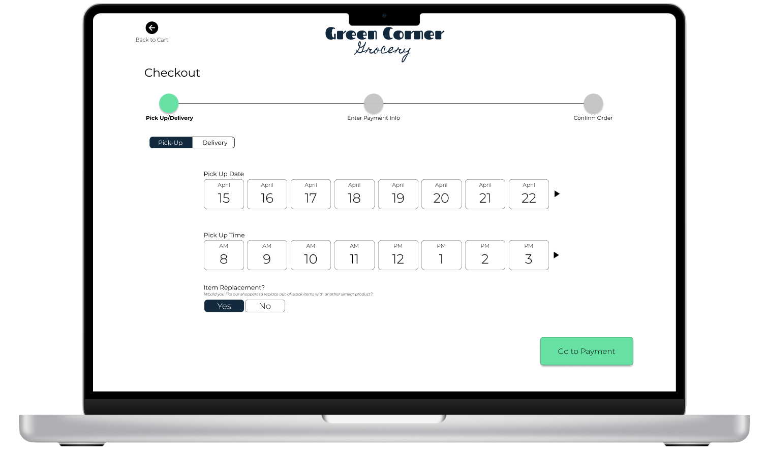
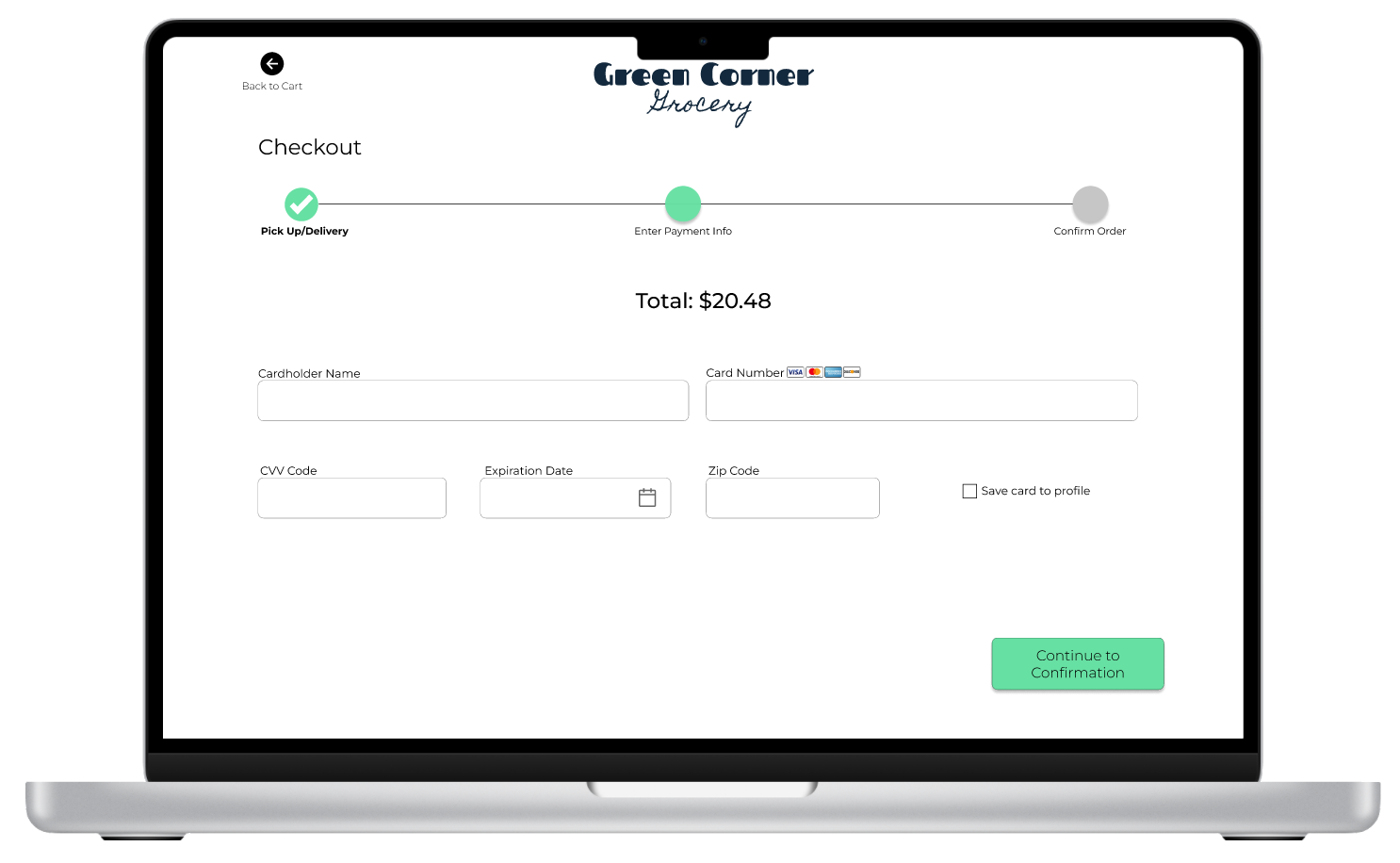
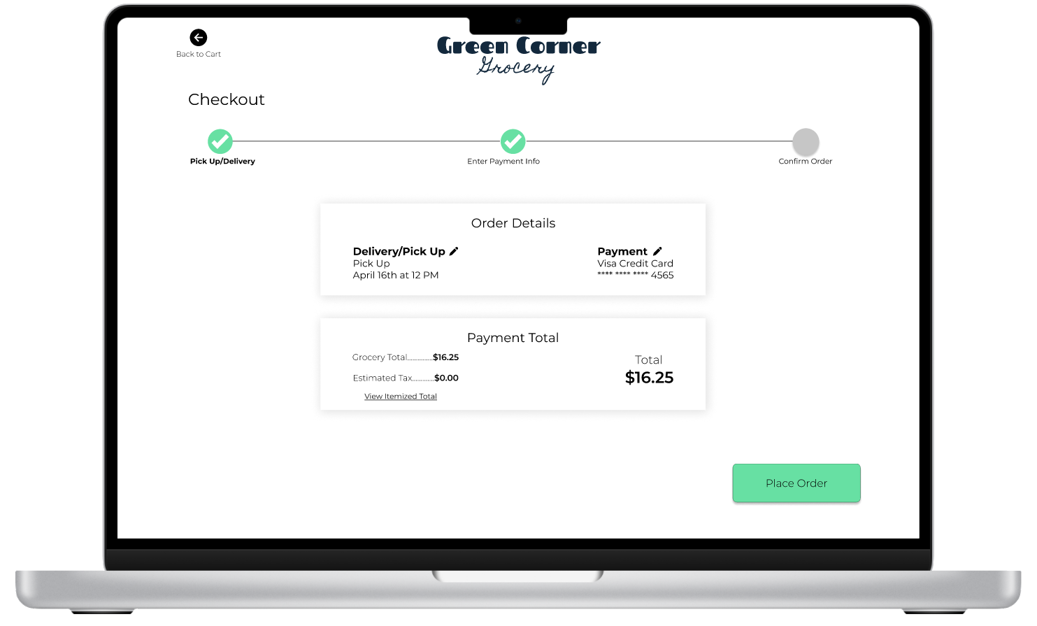
Desktop - Product Order Workflow
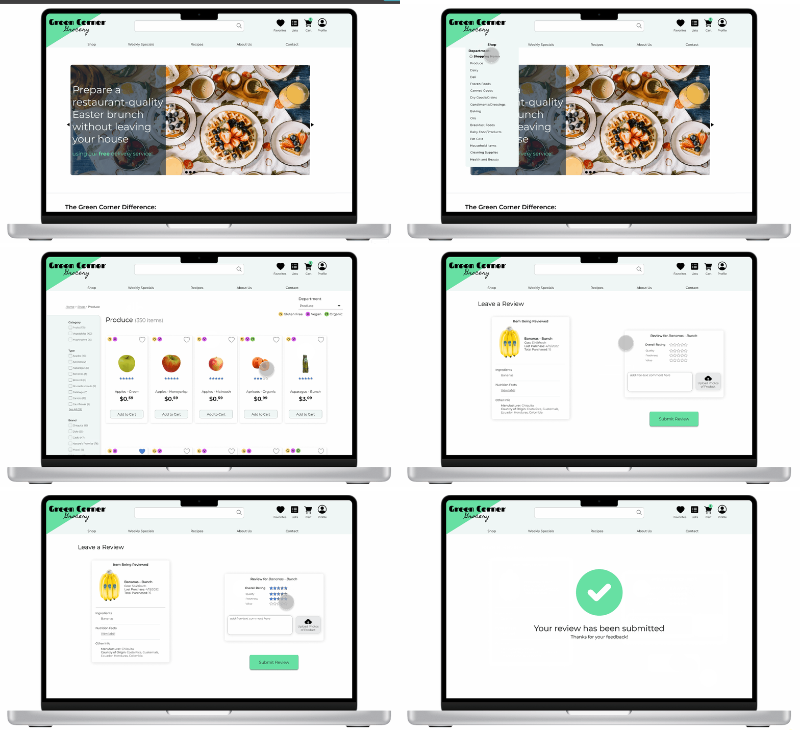
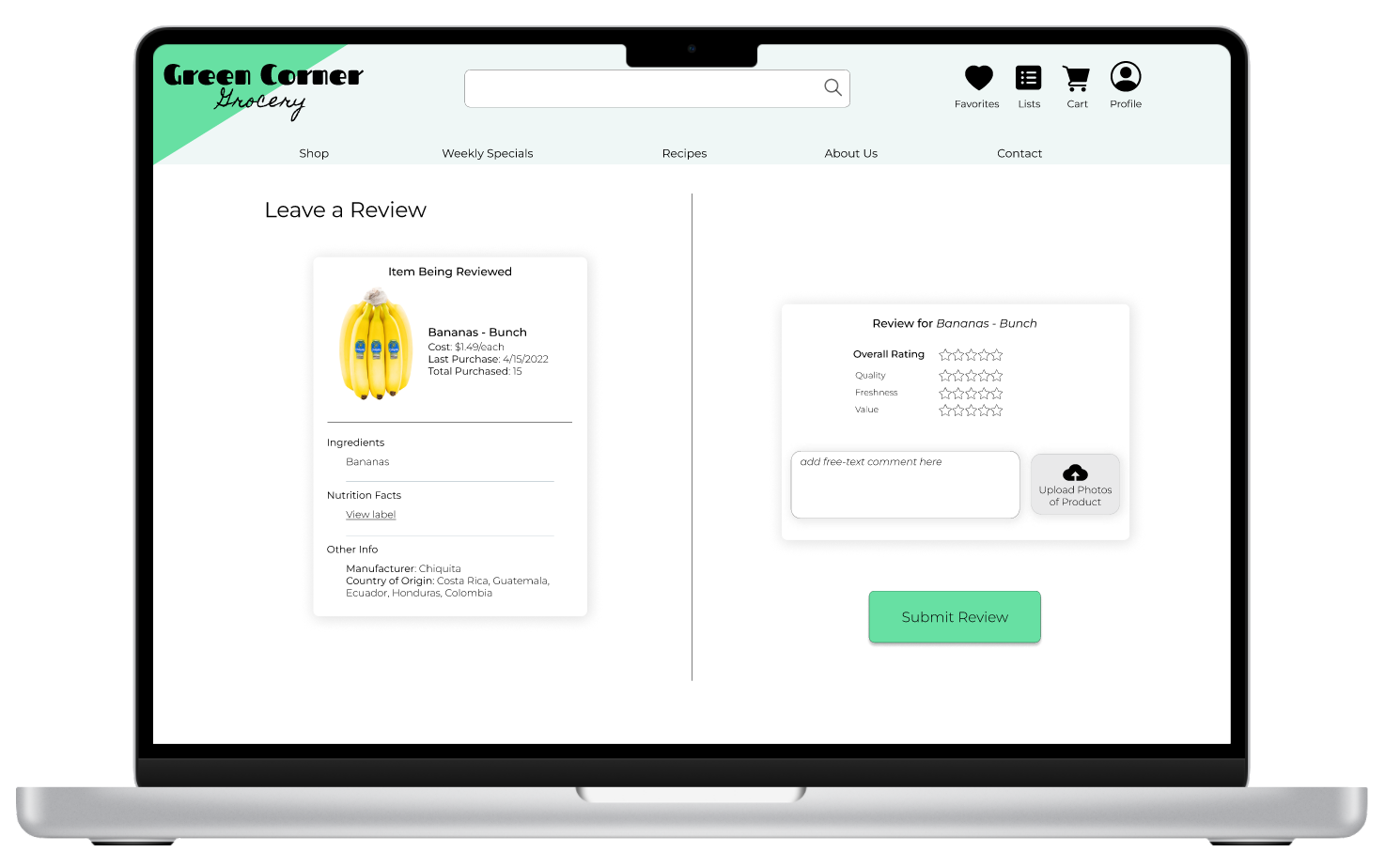
Desktop - Product Review Workflow
Mobile Wireframes
GATHERING FEEDBACK: USABILITY TESTING
What we Tested
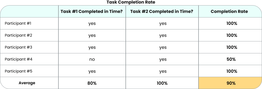
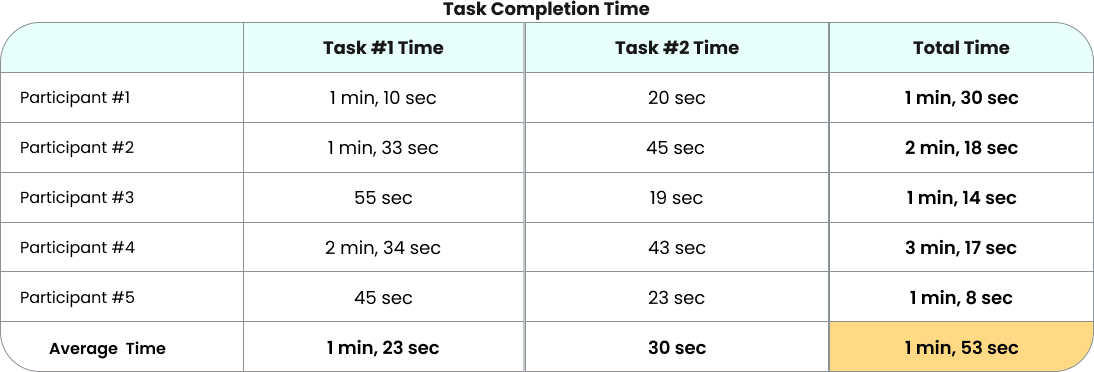
Using the prototype above, 5 usability tests were conducted to gather feedback on the new features. Users were asked to complete the following two tasks, with the goal of completing task 1 in less than 2 minutes and task 2 in less than 1 minute and 30 seconds:
Quantitative Results
Qualitative Results
HIGH-FIDELITY WIREFRAMES: SECOND ITERATION
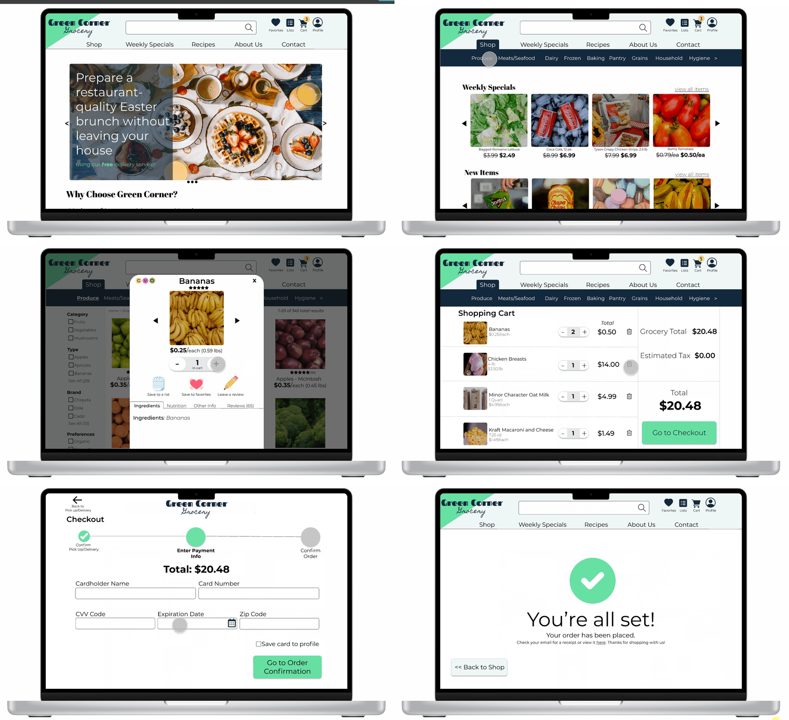
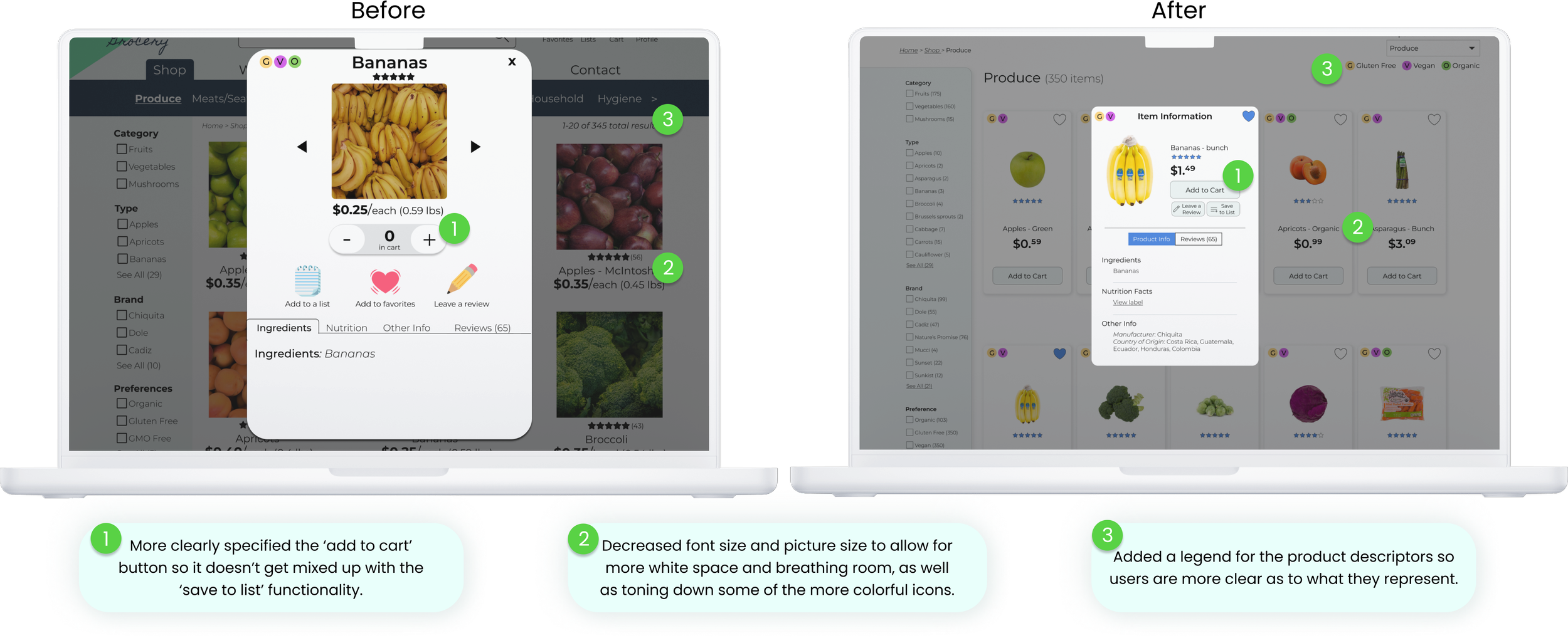
Based on the feedback of the usability testing, I made some updates to the wireframes for Green Corner’s site. Here is a breakdown of some of the main changes on the product information overlay:
You can see an updated prototype below:
Product Ordering Workflow
Product Review Workflow
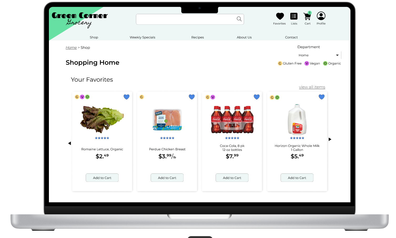
Final Wireframes
FEATURE OVERVIEW
Product Information Overlay
Indicates at quick glance whether a product is gluten-free, vegan, or organic.
Add a product to favorites or a list (for ingredients for a recipe, for example).
Leave a review for a product.
View product info, including ingredients, nutrition facts, manufacturing information, and reviews.
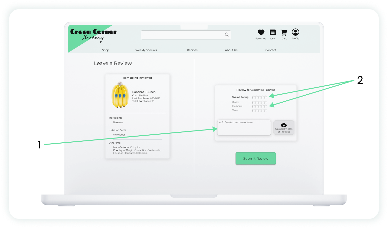
Product Review Screen
1. Leave a free text review for a product.
2. Provide an overall product ranking, as well as ratings for more specific qualities of the item.
PROTOTYPE: TRY IT YOURSELF
You can try the interactive prototype of the proposed Green Corner desktop site below:
NEXT STEPS
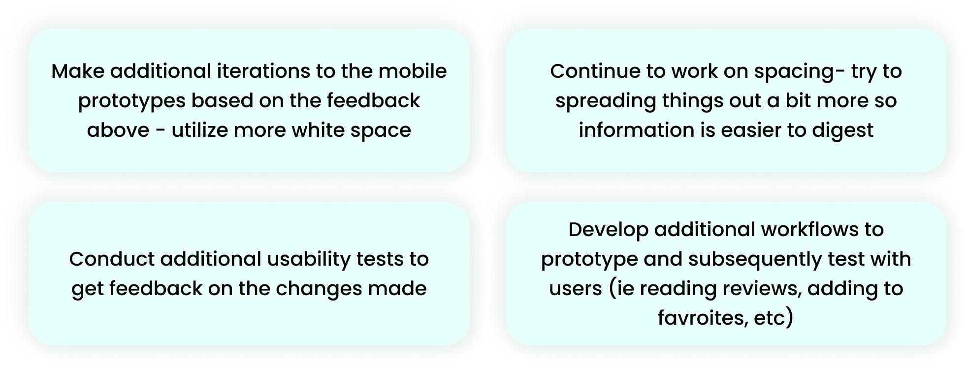
After making the changes above for my second iteration, these are the next steps I plan to pursue:
FINAL THOUGHTS AND LESSONS LEARNED
To conclude, given the shifting e-commerce market, I recommended Green Corner adopt a more robust online shopping experience that includes product reviews and detailed product information. The volume of customers purchasing groceries online will only continue to rise, and it’s important to provide an experience that gets as close to in-person shopping as possible. I believe the changes outlined in this case study represent a solid step in that direction for Green Corner.
Turning inward, I also took away some valuable lessons from my work on this project; most notable, the importance of the statement “less is more”. My first iteration contained large text, busy iconography, and little white space. Feedback from the usability testing was clear that the pages seemed to crowded and overwhelming. Going forward, I will be sure to understand the importance of white space and visual rest when designing.
Thanks so much taking time to review this project! If you’d like to see more, you can check out some of my other work here:


